Our Bond Street Showroom in NoHo, NYC – The Sebastian Cox Kitchen
21st October 2020
It’s time to show you the final kitchen in our NYC showroom, and I have to say, I think this display might just take first place for me. Our Sebastian Cox Potting Shed is not what you expect when you think of a kitchen in the heart of bustling Manhattan but it’s totally perfect and showcases this range of furniture beautifully.
Our showroom was previously a clothes shop and the interior was pretty plain, essentially just one long white box with six dark, dingy concrete boxes formerly used as changing rooms at the back. Our builders quickly set to work opening up windows and doors and stripping plaster and knocking down the ugly boxes, making the whole place lighter and brighter and also creating the little gem of a space for our Sebastian Cox cupboards!!
This showroom has been designed and styled by Helen Parker, deVOL’s Creative Director. Helen has that knack and always manages to create really classic, truly beautiful rooms with something that sets them apart and makes them so memorable. And it’s funny, despite being one of the hardest renovations, our Sebastian Cox Kitchen almost feels like it has had the least work, and that was exactly the aim. The beauty of these cupboards is in their simplicity and Helen wanted a space that felt rustic, natural, calm, just a place that is easy to be in and one you never want to leave.
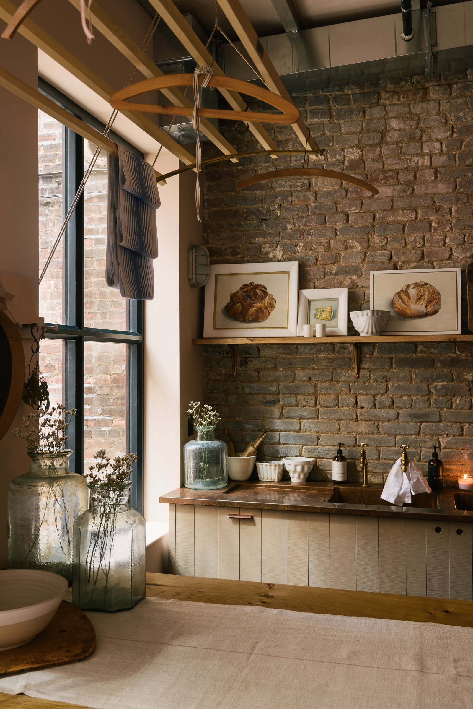
This collection of furniture was designed in collaboration with British designer, Sebastian Cox. It’s a culmination of our passions: simple design, impeccable craftsmanship, traditional techniques and the use of sustainable timbers. The cupboards are made predominantly of British beech, an abundant but underused material that works so wonderfully if treated thoughtfully.
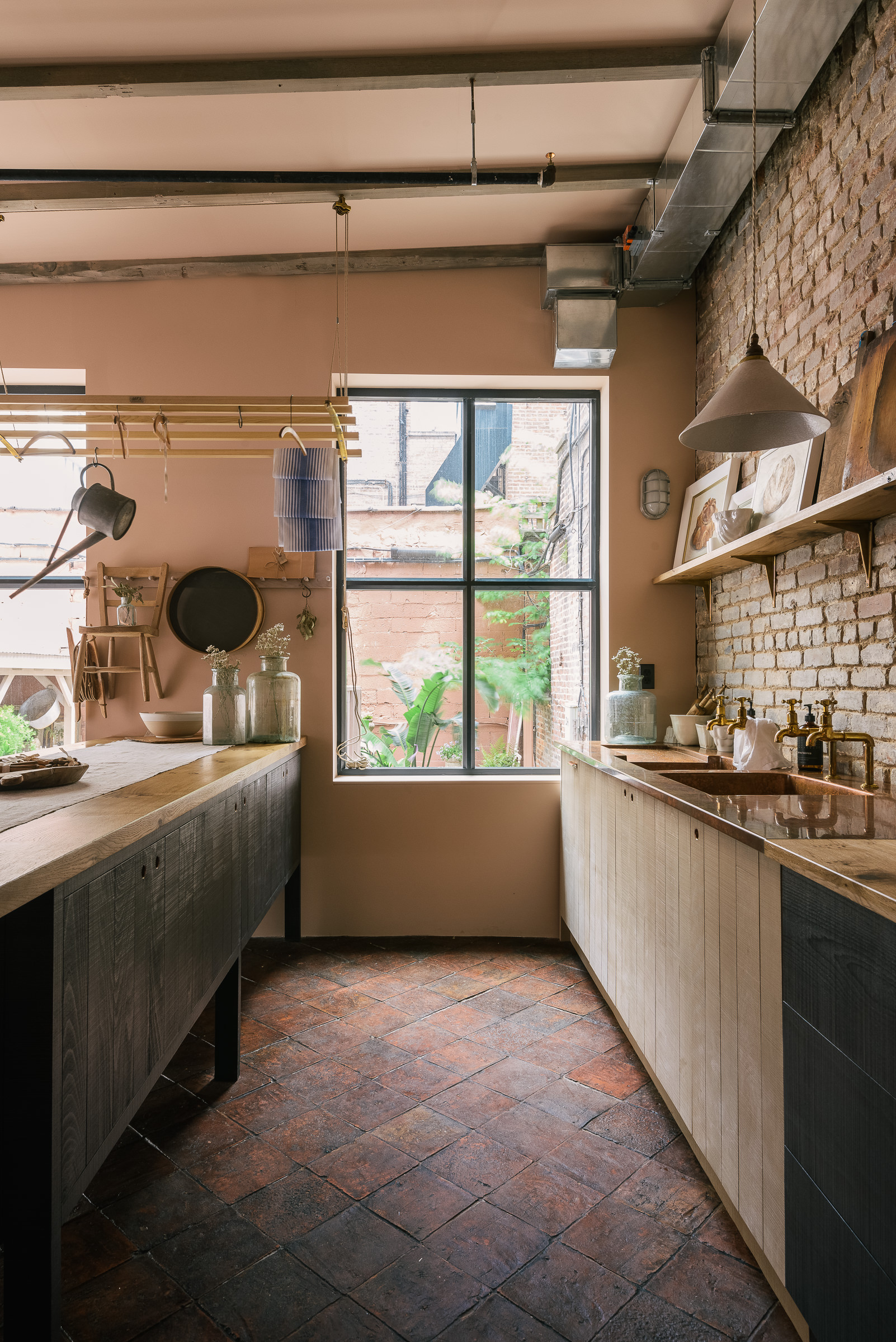
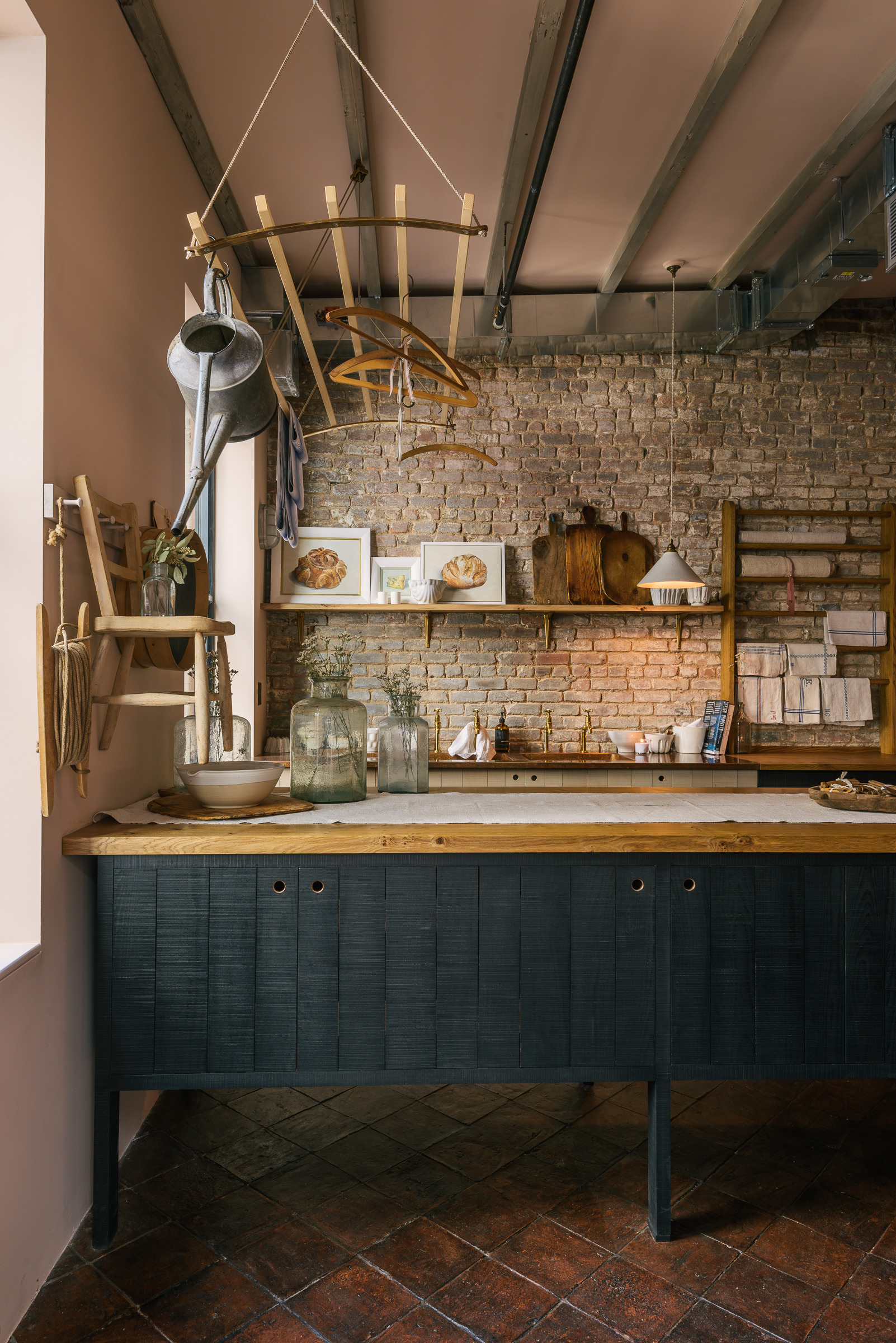
We went for a super simple layout, a run of cupboards down one length of wall, a prep table in the middle and a pantry and fridge on the opposite wall. It’s designed as a potting shed so there’s no cooker, although a mini Bertazzoni range would look perfect in here too!
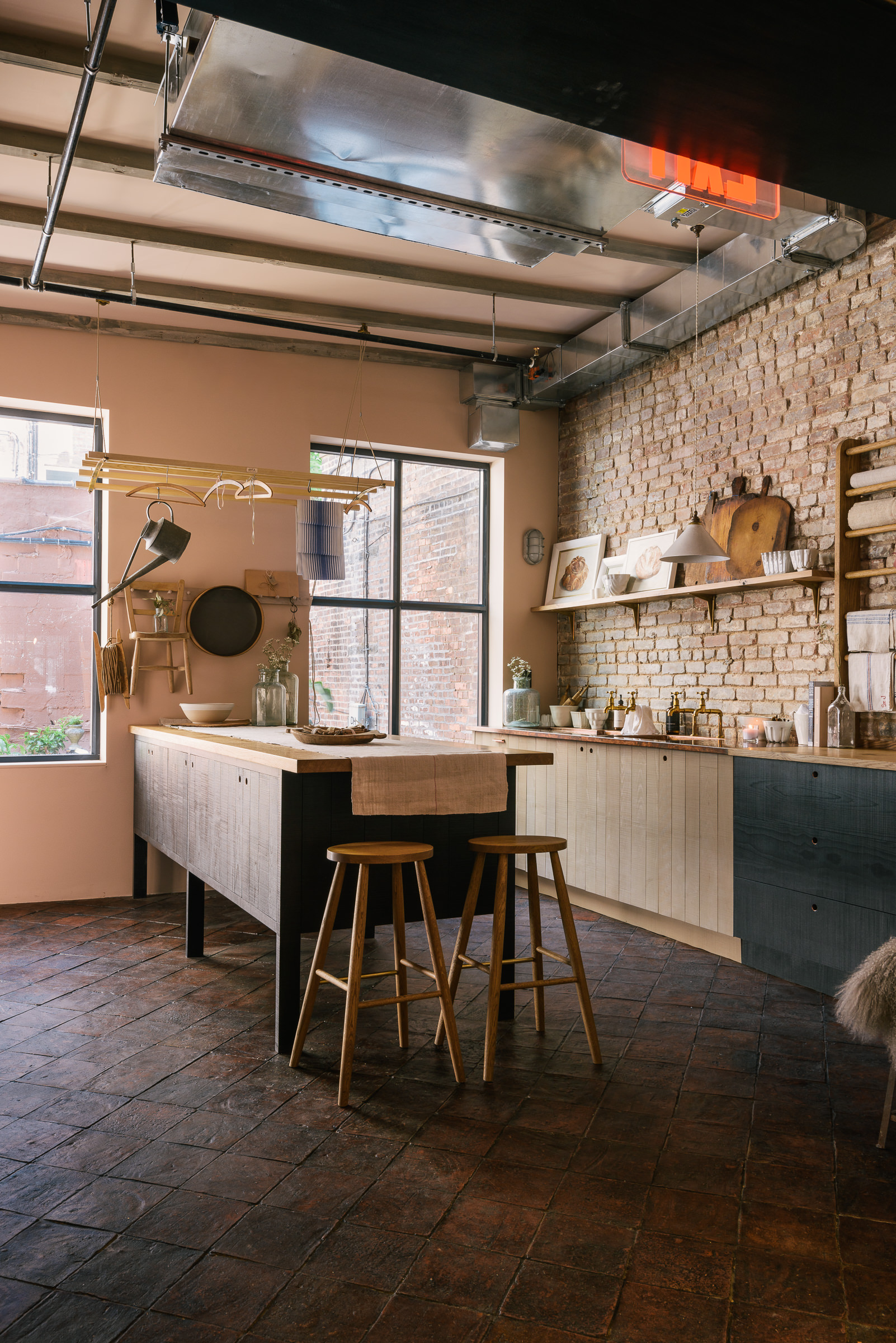
You’ll notice our Sebastian Cox cupboards aren’t painted in the traditional way. We have actually developed a small collection of dyes that are designed to sink into the beech, rather than coat it completely, so that you can still see, feel and appreciate the texture and grain of the timber beneath. These soft washes of colour are then sealed with a clear matte varnish to protect the finish and stop any spills permeating through into the wood.
Helen went with a really classic colour combination for the cabinetry, a mix of our ‘Inky Blue Black’ and ‘Natural’. It’s the most popular option with our customers and just seems to work in all kinds of spaces. The walls are ‘Setting Plaster’ by Farrow & Ball, the most perfect neutral with the teeniest hint of pink which gives such a lovely softness to the room.
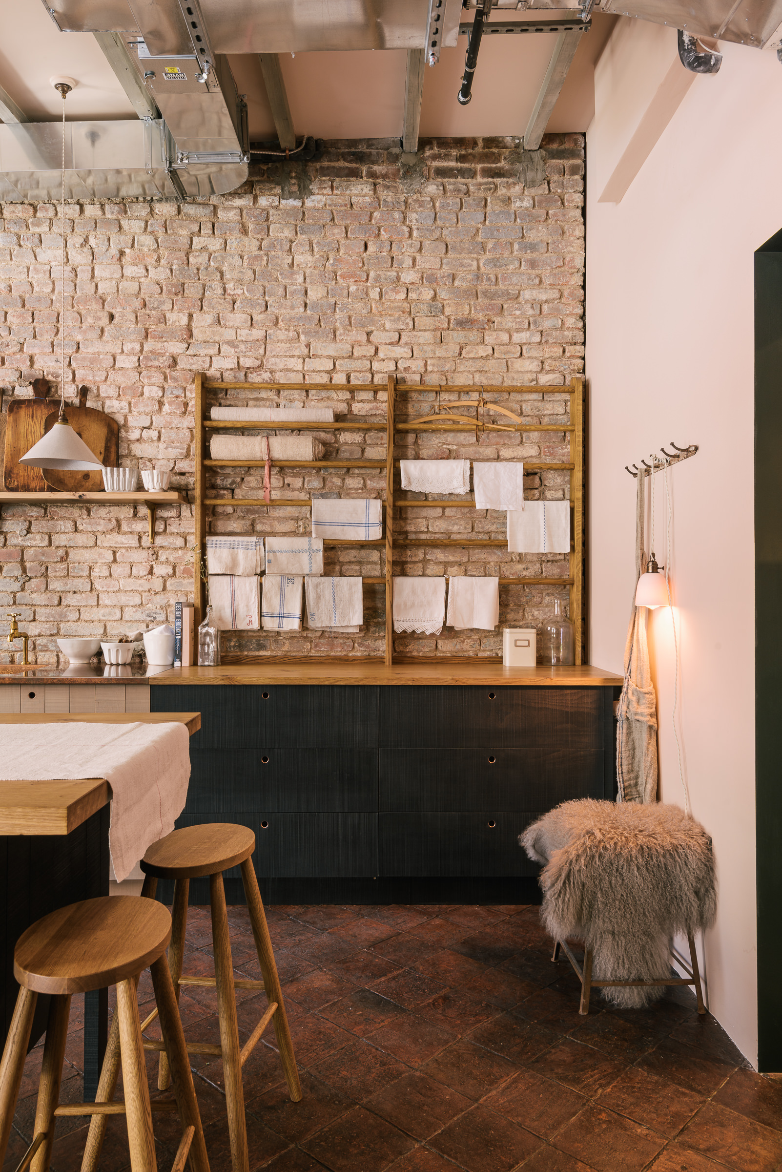
All our furniture is designed to work beautifully together and we love showing you the possibilities in our showrooms so we thought we’d include an oak linen rack from our Haberdasher’s range in this display. This rack is traditional but fun and a wonderful spot to display our ever-growing collection of vintage linens, although it would look equally good with a plug-in Porcelain Pendant or even a few of our handmade mugs hanging from little ‘S’ hooks.
This kitchen is so tactile, from the rough sawn cabinetry to the brick wall and, of course, the rich terracotta tiles. The floor is by our sister company, Floors of Stone, and is definitely one of our favourites. It just makes every room feel better than it did before and it’s perfect for a kitchen because it’s very classic and very hard-wearing. It gives this room the rustic, humble quality we were after and I think the colour is just so good.
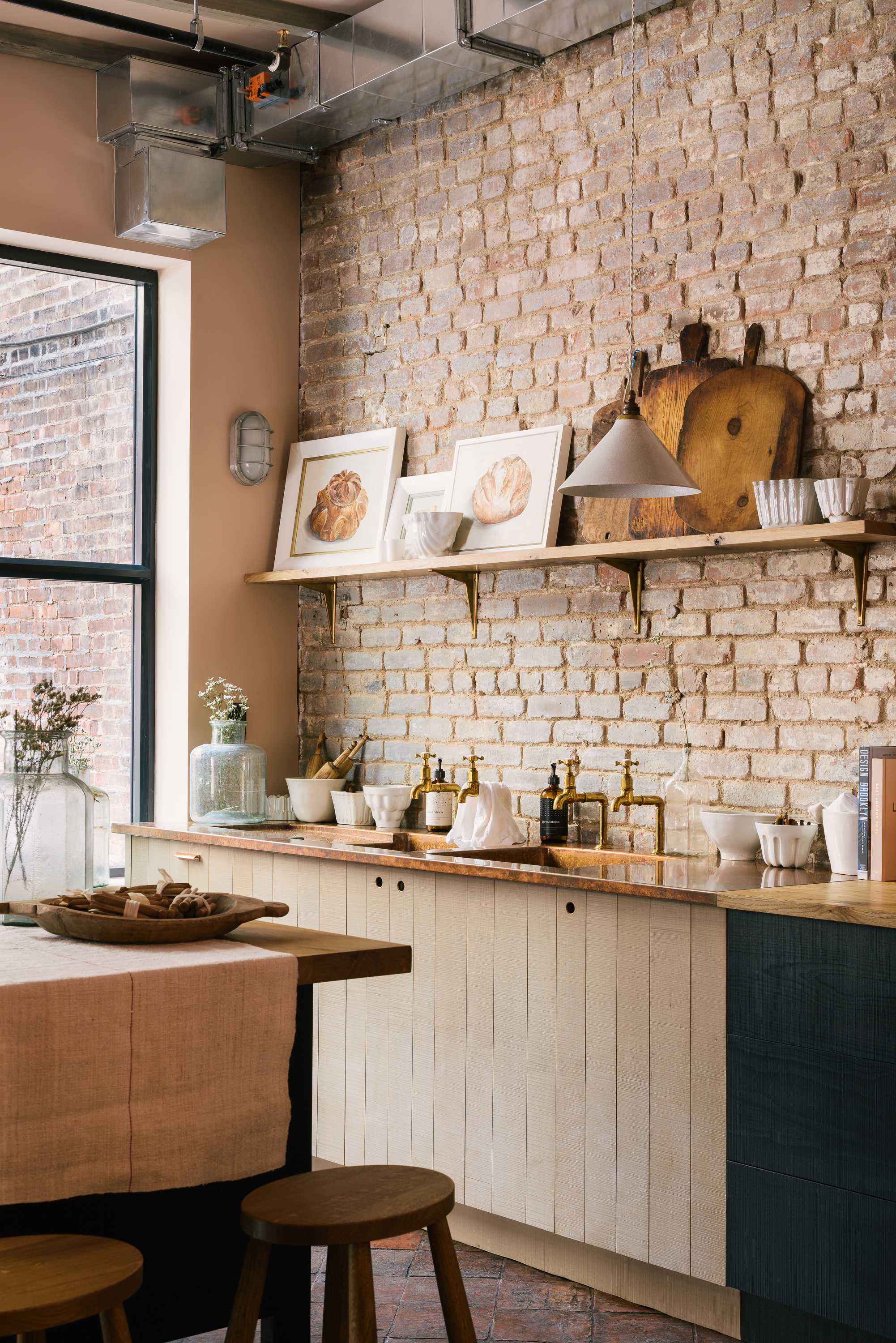
Oooh and the worktops! The prep table and half of the main run have been topped with oak and the other half is made entirely of copper, including two sinks and an integrated draining board. It’s our bespoke-hand aged copper, expertly weathered by our metal team in our studio in Leicestershire and absolutely brimming with character. This surface has become a little bit of an icon here at deVOL, we have it on show in all four of our showrooms and so many our customers opt for it in their kitchen, whether it’s a little undermount sink, a section at the end of an island or a full run with all the works like our St. John’s Square Townhouse Kitchen. It just looks so good. And it’s super easy to look after too, we leave the metal unlacquered so it’ll continue to develop a patina as it ages and there’s no need to worry about little marks or scratches, all they do is add more personality to this striking material.
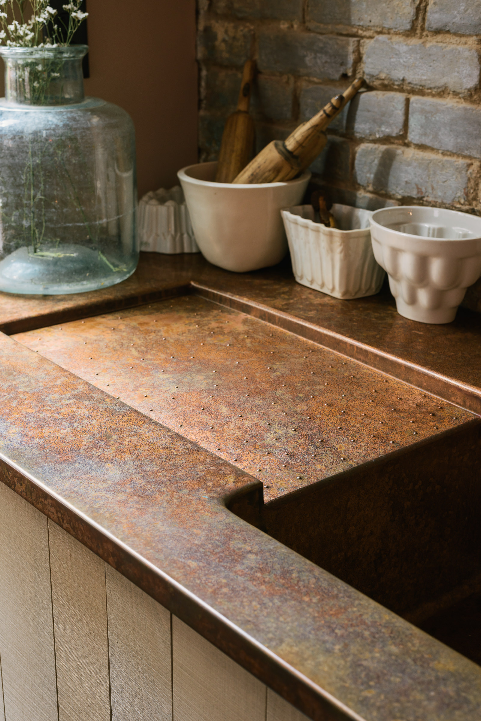
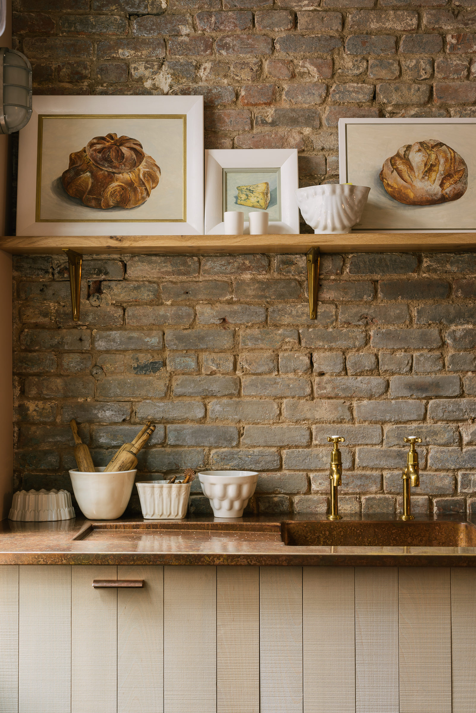
We’ve spoken about mixing metals quite a few times and here is a perfect example of how lovely this look can be. Lots of copper and a little bit of brass. These are our Mayan taps, we collaborated with Perrin & Rowe many moons ago on a collection of classic taps in the ideal living brass finish. Similarly to the copper, these taps aren’t sealed so they’ll also gain a patina over time and get a really gorgeous mottled finish. It just makes a kitchen feel so much more authentic if everything has a little bit of age, we don’t like things brand new and shiny and spotless. We’ve always loved Mediterranean interiors and it’s a look we try to emulate often, the idea of ‘perfectly imperfect’ with marked marble, mottled metal, wood with scratches that show how used and loved it is. Although a little more English country than Italian or Spanish, this potting shed definitely has that same feel and it’s just so interesting and cool to see how great it looks and how well it has been received over here in New York.
Our dream kitchen always has a pantry, whether it’s a huge walk-in one, a fitted dresser or an elegant freestanding Sebastian Cox cupboard like the one in our NYC showroom. This is a thing of beauty, it’s quite slim and tall and the back panel is made up of handwoven strips of ash. It’s such a delicate and unusual detail and one of the features I love the most about this range. This particular cupboard is glazed with wobbly heritage glass which I think is beautiful but you can also go for a closed front with the well-known bandsawn panels – ideal for those who don’t want to worry about anybody looking in and seeing their not so perfectly organised pantry!!
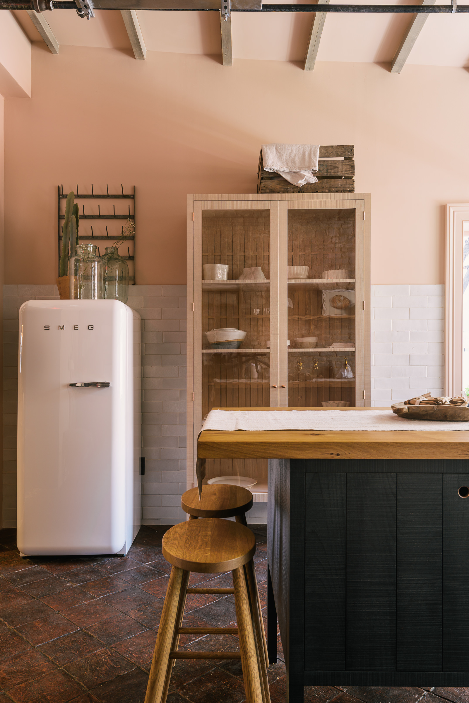
Next to the pantry is a Fab Smeg fridge, our favourite. This pair goes hand in hand and you can see it in lots of our projects. A chunky retro-style fridge and an elegant, airy pantry, it’s not a combination you might think of initially but once you see it, you just get it! Behind these two is a half wall of Crackle Metro Tiles. This collection is handcrafted by our small team of ceramicists at Cotes Mill and features our signature crackled finish in the timeless metro size and style. These tiles are really cool, the crackles vary from tile to tile so going for lots of them adds so much interest to the room.
And along with all of these many lovely things, there are all the little details too that really make the room. The paintings propped up on the oak shelf are by Katie Wilkins and are absolutely perfect, I often try to pick a favourite when chatting with customers and I just can’t. Oh, and the industrial-style shelf brass brackets, another goody by our metal team. The handcrafted Crackle Pendant, the Laundry Maid, the vintage jelly moulds, I could go on and on, it is all just lovely and really turns this into such a beautiful and evocative space.
– We’d love to show you around our NYC showroom in person! To book an appointment, please get in touch.
– You can take a look at some of our other favourite Sebastian Cox projects here.
– Keep up to date with all our latest news over on our Instagram.

