New showroom in the Millhouse
27th March 2017
When I first started working at deVOL, Paul gave me the opportunity to learn some computer aided design. I began my training by measuring up a room in the millhouse, which would eventually be the space for a new Shaker display kitchen. I measured literally everything in that room and then came back to my computer and attempted to draw it up (with lots of help from everyone), it was really different to anything I had done before. I learnt so much from doing it, and I was really eager to see what the kitchen in the millhouse was going to look like, as I had spent lots of time in there with a measuring tape, surrounded by plaster and paint. Part of my job at deVOL is to show customers around the showroom and give them a general idea on what we have to offer, which I love. On Saturdays I get to cover the reception desk, we are often a lot busier on Saturdays than in the week, I like it though because it’s really nice showing couples or families around the showroom, and seeing their reactions as they start to get excited about planning their kitchen. Well, when I saw the Shaker kitchen in the millhouse once it was complete, I was so excited because it really was so different to anything we had on display, I just wanted customers to come in so I could show them this new space for the first time and see what they thought.
Sometimes, I think you need to see something with your own eyes before you can make a judgement on it. I think this because, up until now, I have always judged dark coloured kitchens. I fell in love with the bright and airy deVOL kitchens, clean and safe with white cupboards and wooden worktops. I just thought dark kitchens didn’t seem so inviting, maybe even a bit intimidating. And then I saw this.
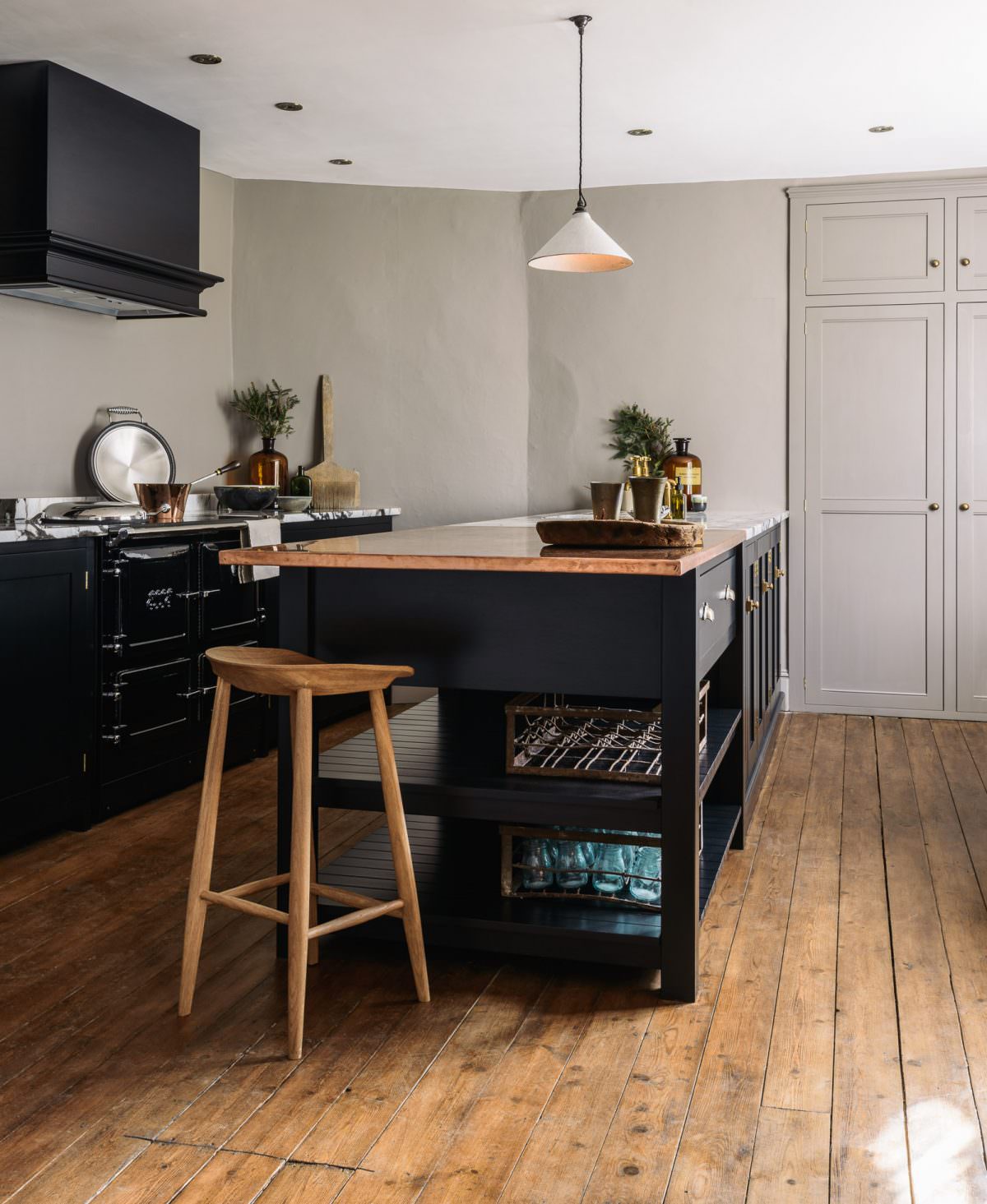
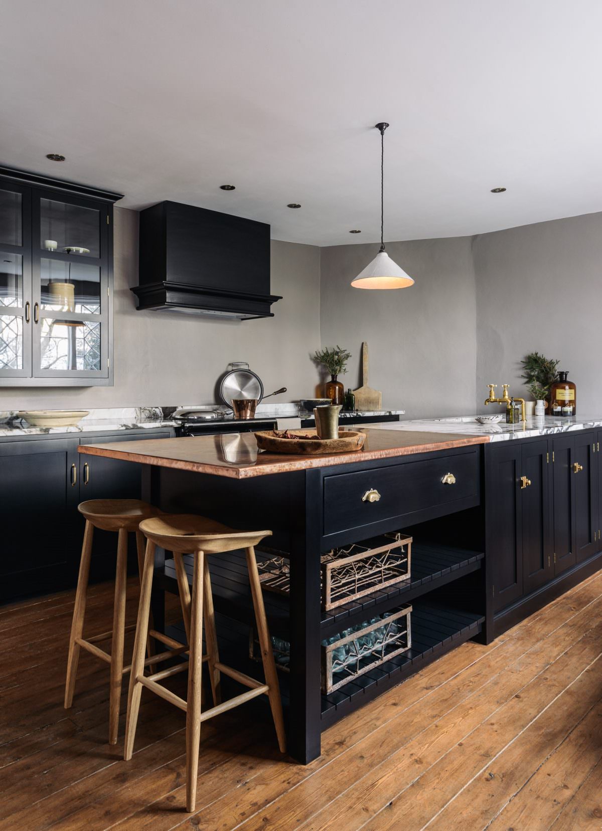
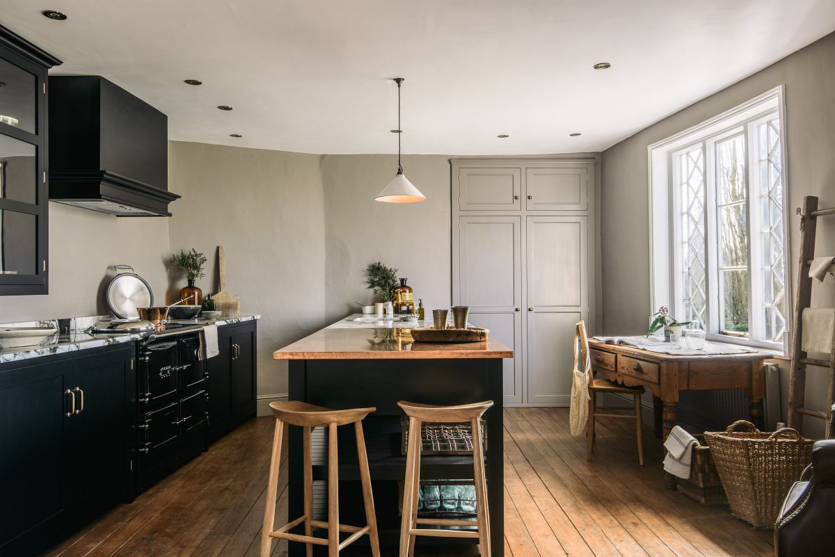
This simple Shaker kitchen is made up of a run of three double base cupboards, a double bin cabinet, a double door sink cabinet, an integrated dishwasher fascia and a prep table with open slats on the end. On the back wall, there is a chunky black ESSE range cooker with a grand canopy overhead, deep bespoke cabinets either side and a beautiful London Glazed Wall Cupboard. The cabinets are painted in our new Shaker colour, Printer’s Black. Using dark cabinets along the perimeter of the room creates a dynamic space, the room doesn’t feel too heavy, it is balanced and proportioned.
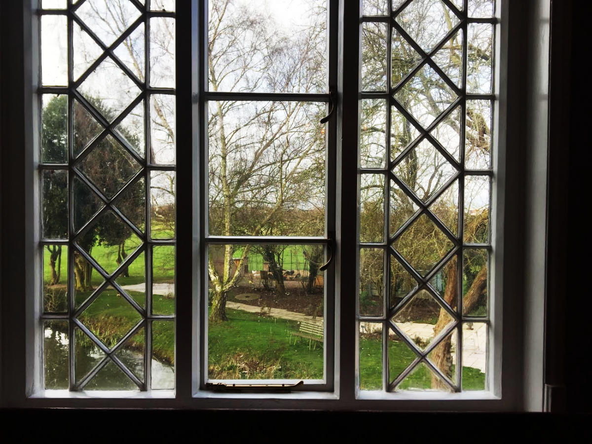
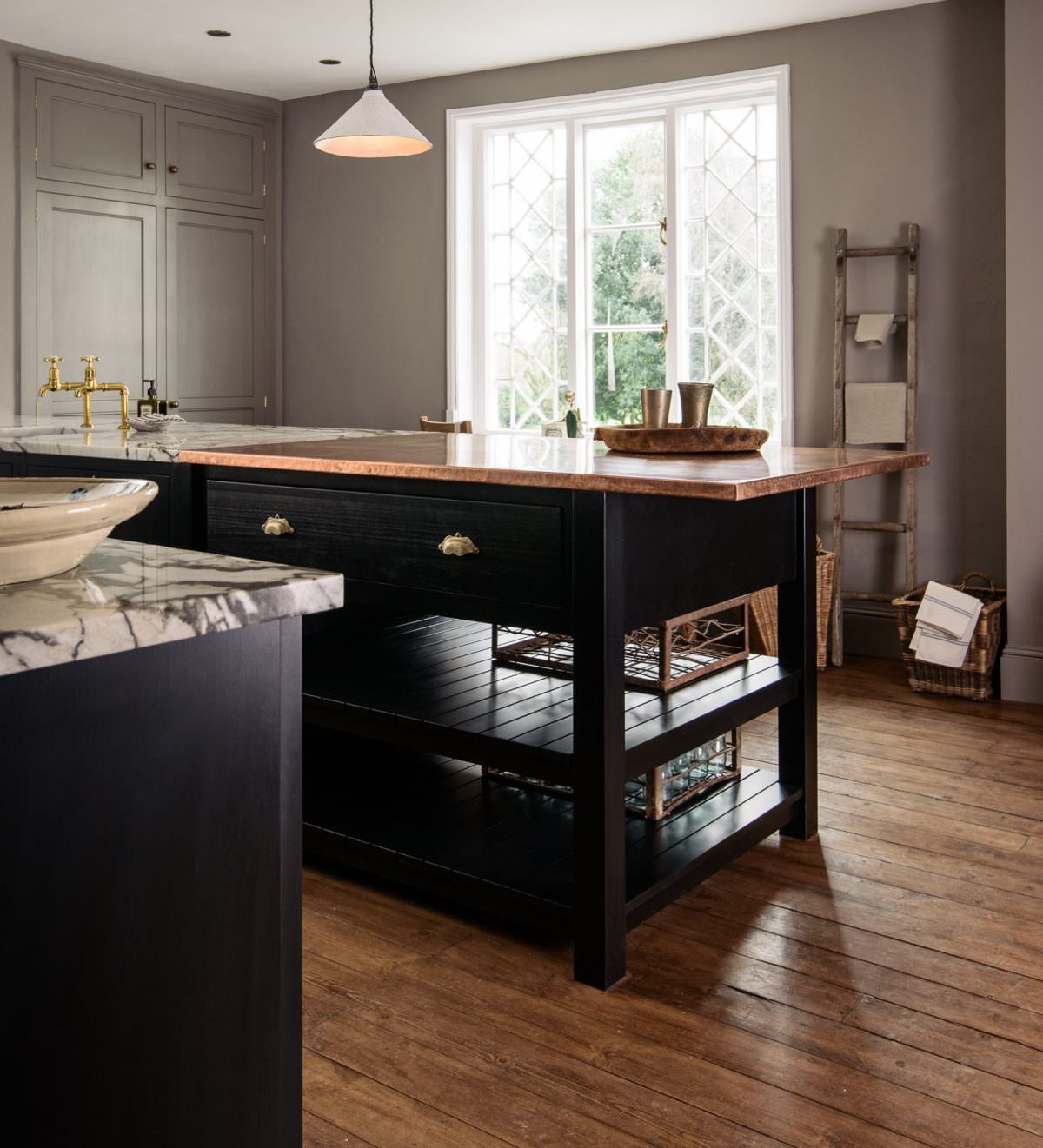
The doors on the back wall conceal an awkward little corner and is now a spacious, very practical cupboard! Just one of the many ways you can incorporate bespoke cabinets in to your home through clever design. Our Creative Director, Helen, is such a talented kitchen designer, having just designed our stunning new showroom in London, I suppose I should have expected nothing less really, her clever designs and daring decisions make truly beautiful kitchens. Dark cabinets only work providing the space is fairly open with a good source of natural light, a small, poorly lit kitchen can make the room feel heavy and enclosed. Fortunately, this window provides the most wonderful light which floods through the room, especially with the kitchen being south from the window. This original 16th century window holds the most wonderful view of the millpond and peacock pen, this space was the perfect place for this kitchen.
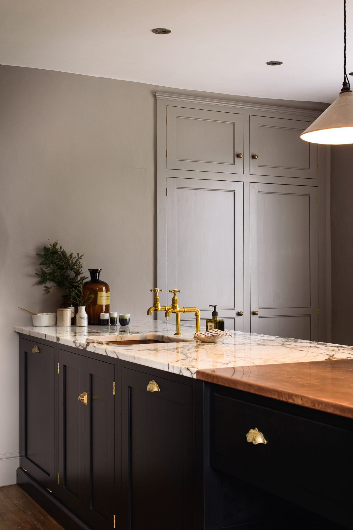
Mixing dark and light together creates an instant elegance when you enter the room. The mixed material worktop has a big part to play. There are two very different worktops on display to show you how worktops can support and compliment a dark kitchen, in terms of natural light and visual space. The San Simone quartzite is like nothing I have ever seen before. This stunning piece of stone originates from Brazil, the crystalline structure emphasises the dark veining, it is dramatic but also gives the kitchen formality and style. As this is a natural stone, it is more porous and more prone to stains and marks, so they just require a little more love and attention. The copper worktops are made here at Cotes Mill by our Workshop Manager, Ben. A sheet of copper is wrapped around a plywood core, the copper is then hand beaten around the plywood to make sure it’s nice and sturdy. The worktop is then treated with lemon juice, vinegar and other acidic substances to create an authentic mottled effect. Copper will scratch and mark, but we love the way the copper changes over time, it adds to the charm.
Decorating this kitchen with aged brass accessories compliments the richness of the cupboards and adds a sophisticated charm. Especially Stephanie’s boho cup handles, which you can see on the prep table. They have a natural, pitted texture and are light to the touch. Bohemian in style, the brass cup handles add an elegant feel to any kitchen cupboard (these pretty handles are only available as part of a deVOL kitchen). This special kitchen is starring a few other of our deVOL products, like the Mayan taps in our aged brass finish, which tie in with the door handles nicely. Also, the crackle glazed ceramic pendant and 2 of our bum stools, a perfect addition to any kitchen, they’re also now both on our website! Then of course, you just fill the room with beautiful things, a few copper pans, some ceramic bowls and vintage pieces. I love customers walking into this showroom, it’s so different to any of the other kitchens we have on display. There’s a lovely ambience as soon as you walk in, the way the sun sparkles and shines off the worktops and the warmth of the wooden floor is really inviting.
I realise now it isn’t dark kitchens I was afraid of, really it was just bad design. Risky choices mixed with good design will result in a beautiful kitchen. Good design is something deVOL thrive in, and we are always super happy to help with any design enquiries or qualms you may have. I am excited for the future to see what deVOL will be designing next. I hope this kitchen inspires you to be more daring when it comes to designing your kitchen!

