How We Designed The Stoke Newington Kitchen
24th November 2022
The Stoke Newington Kitchen, it might just be my favourite deVOL project ever. Now, I do admit that is a very hard thing to decide on and stick to but I really do think it is perfect in every way.
The designer of this wonderful kitchen is Alexa, the manager of our Tysoe Street showroom in Clerkenwell and one of deVOL’s most senior kitchen designers. Alexa has worked on some really amazing projects and is an expert when it comes to creating beautiful, functional, classic rooms.
I can’t get enough of this space and our customers and our followers online seem to love it too, so I thought it might be nice to sit down with Alexa and chat all about the project. It’s always fun to delve deeper and find out all the little details… plus, I thought maybe we’d all be able to pick up a few expert design tips along the way!
Please could you tell us a little about this beautiful project?
The customers came into the showroom on a very hot summer’s day back in July 2021. They were in the process of purchasing an 1870s Victorian property in the North London area of Stoke Newington, it needed a good dose of TLC as the place hadn’t been touched in years! When they bought it the kitchen was in a small corner of the lower ground floor but they quickly decided to make the whole front room a large and sociable kitchen and dining room.
Did the customers have a clear idea of what they wanted when they first started working with deVOL?
Yes, they definitely had a good idea of what they wanted. The kitchen had to be a functional but enjoyable place to spend their time. The owners do a lot of cooking, mainly from scratch, so we knew lots of prep space was crucial, as well as a pantry for foodstuff and plenty of storage for small appliances such as an ice cream maker and juicer! An important design element was for the cabinetry to feel more like original furniture pieces, rather than fitted kitchen cupboards.
Once you had their brief, how did you set about starting on a design?
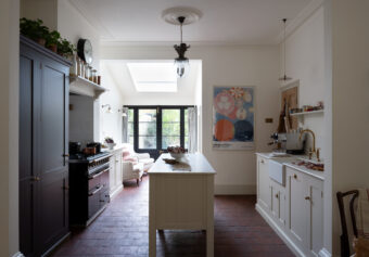
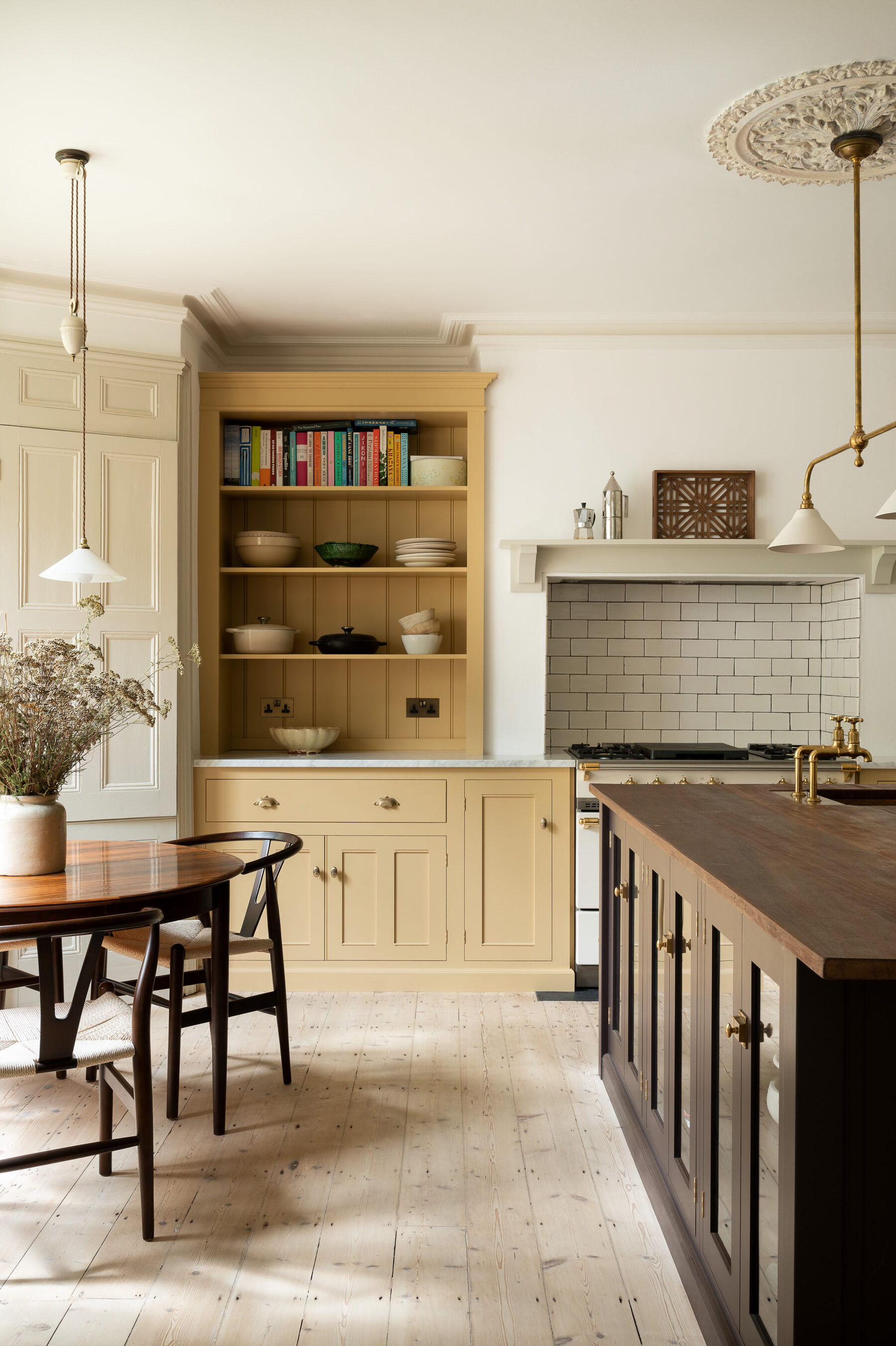
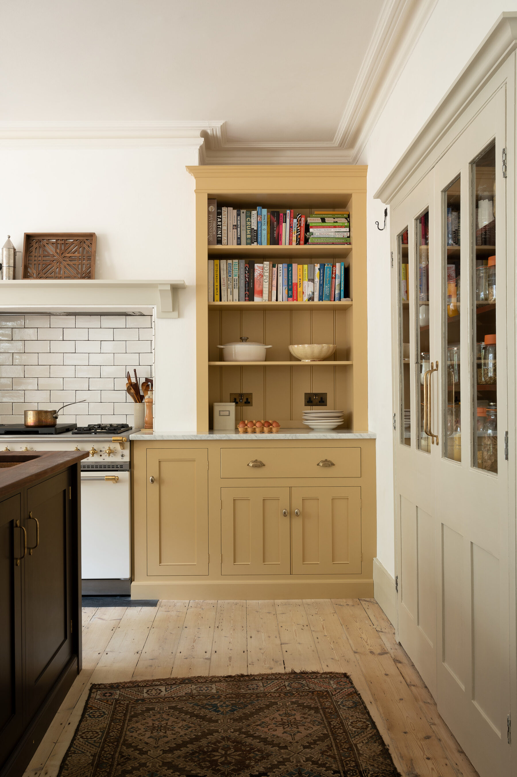
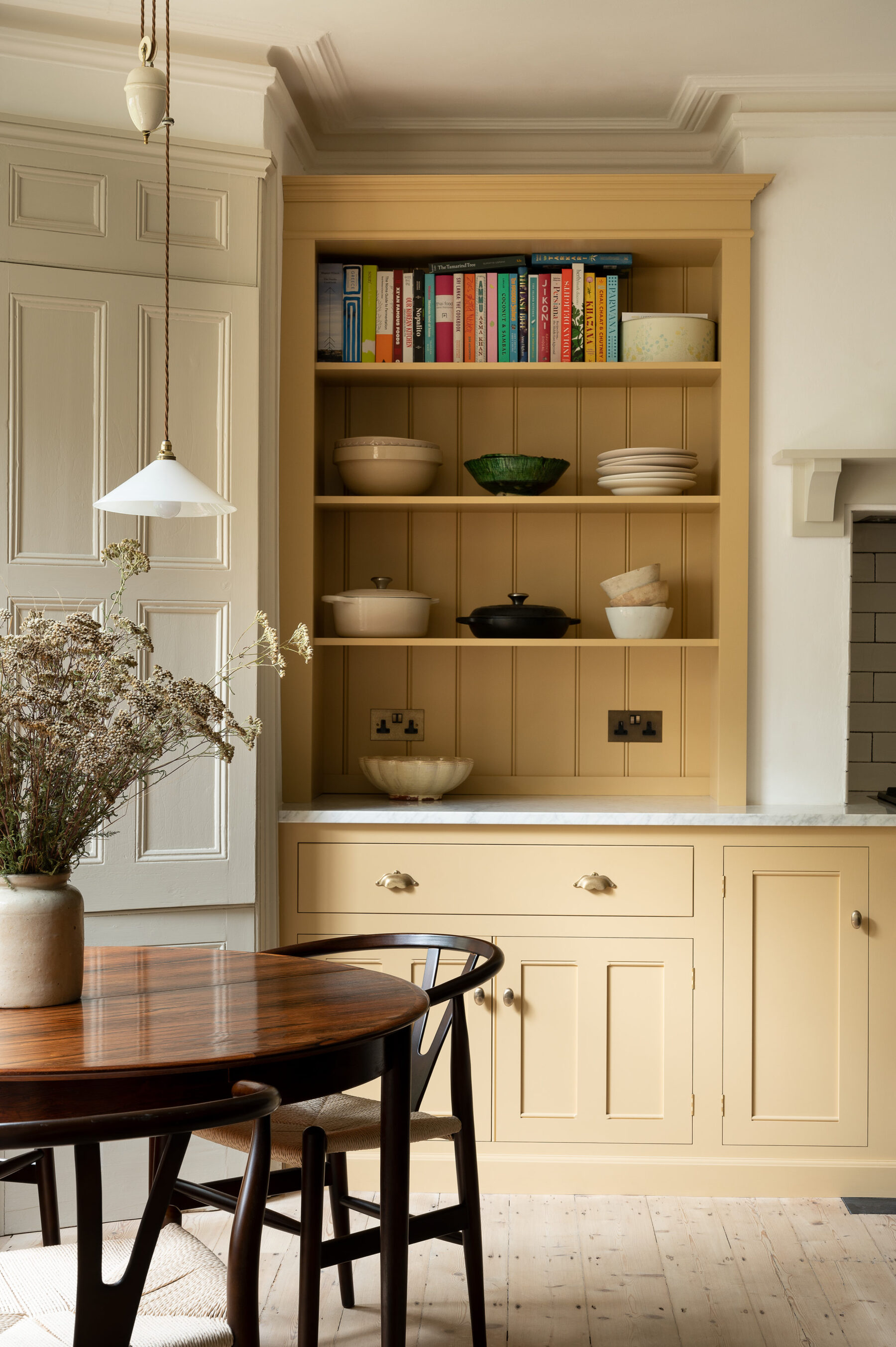
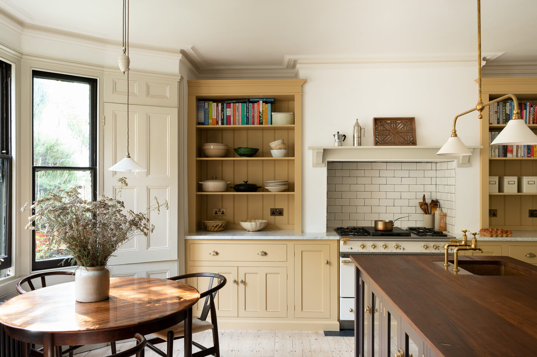
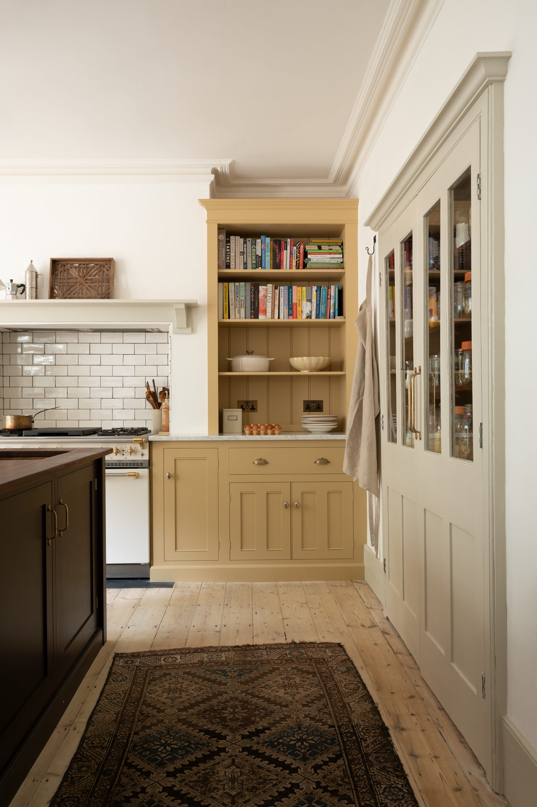
I usually start by positioning the largest items, so firstly we added the range cooker into the existing fireplace. The customers liked the idea of having open shelves and things easy to hand, so we opted for open countertop cabinets on each side of the range, taking inspiration from the much-loved and highly coveted Bloomsbury Kitchen.
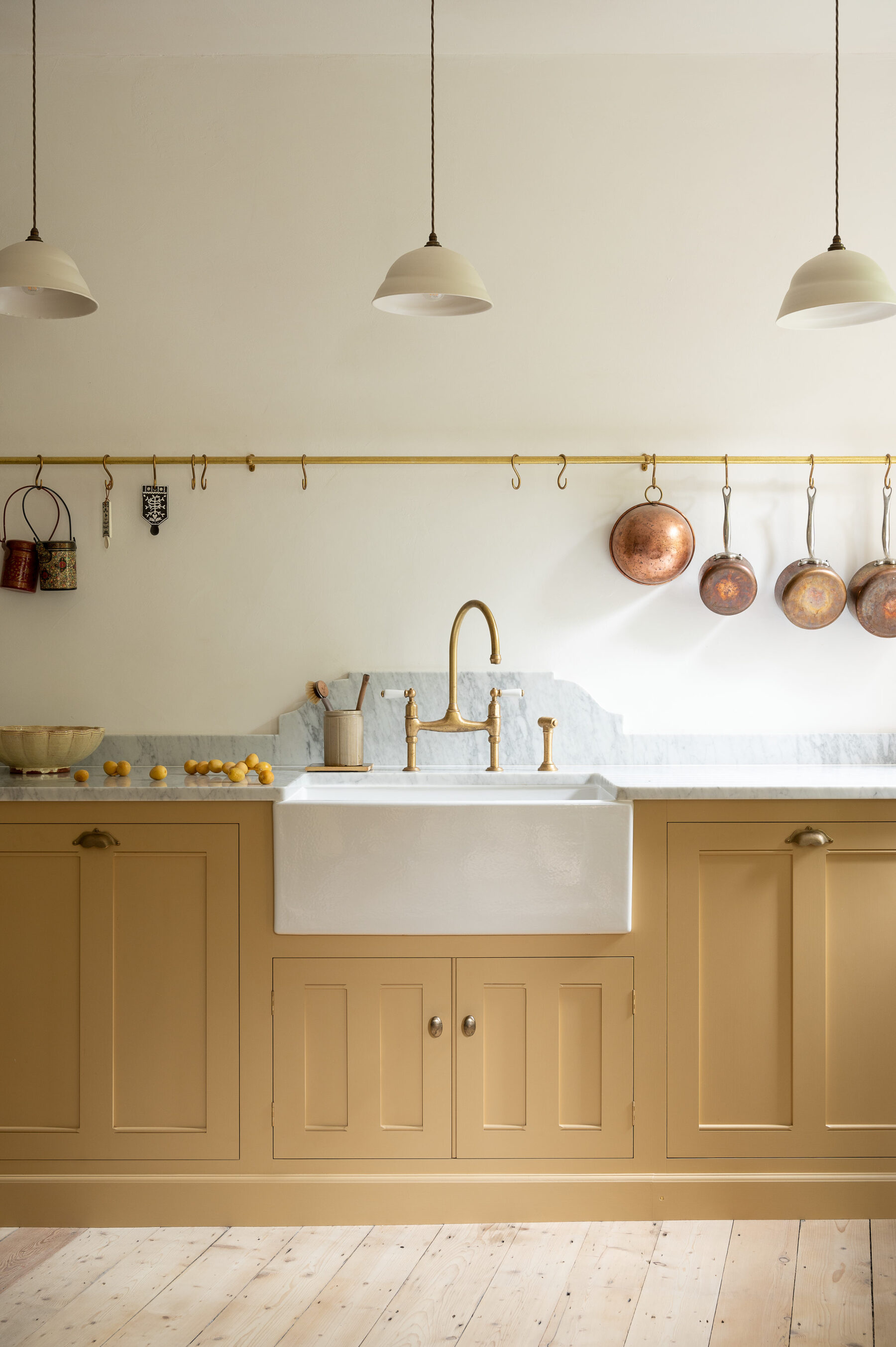
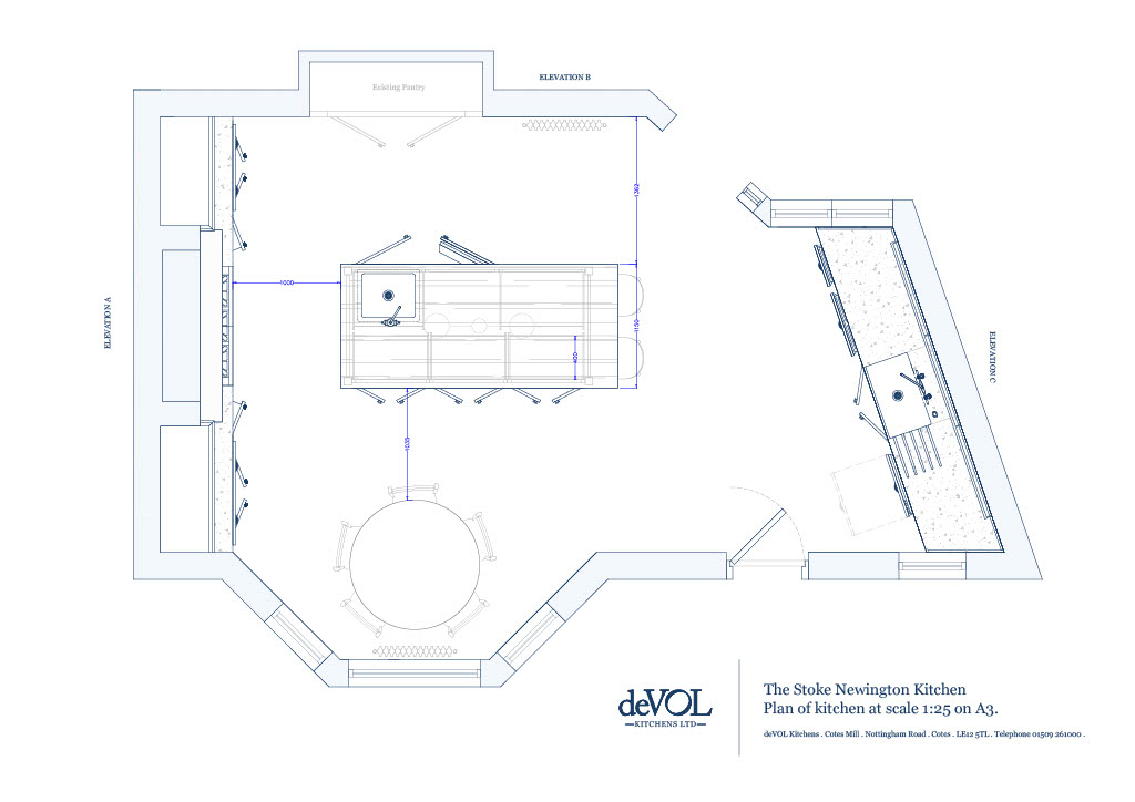
We then discussed adding a large Belfast sink to the opposite wall and a prep sink on the island. The owners were lucky enough to have a built-in cupboard that we very quickly planned to use as a pantry.
How did you find the space as a designer?
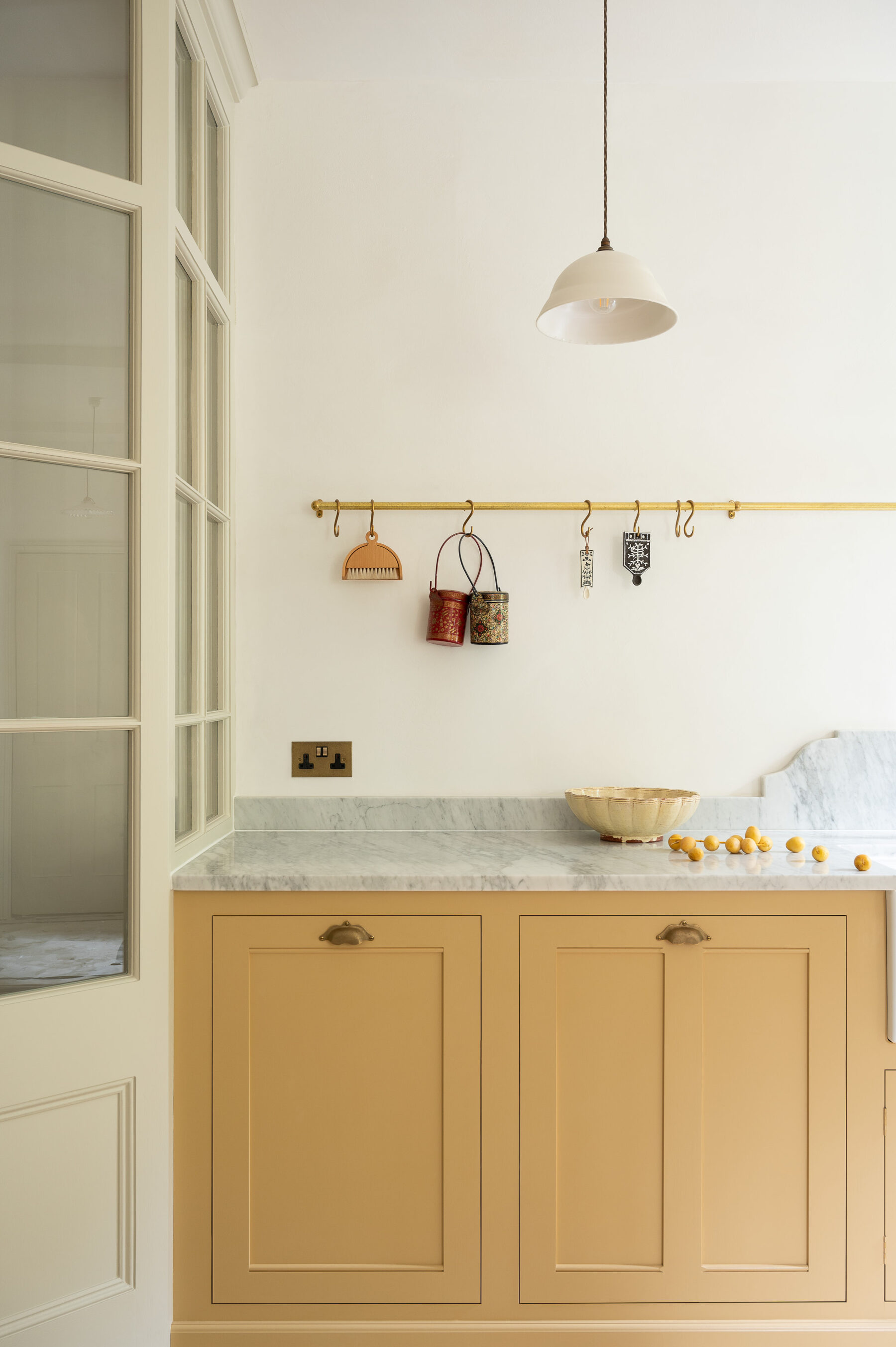
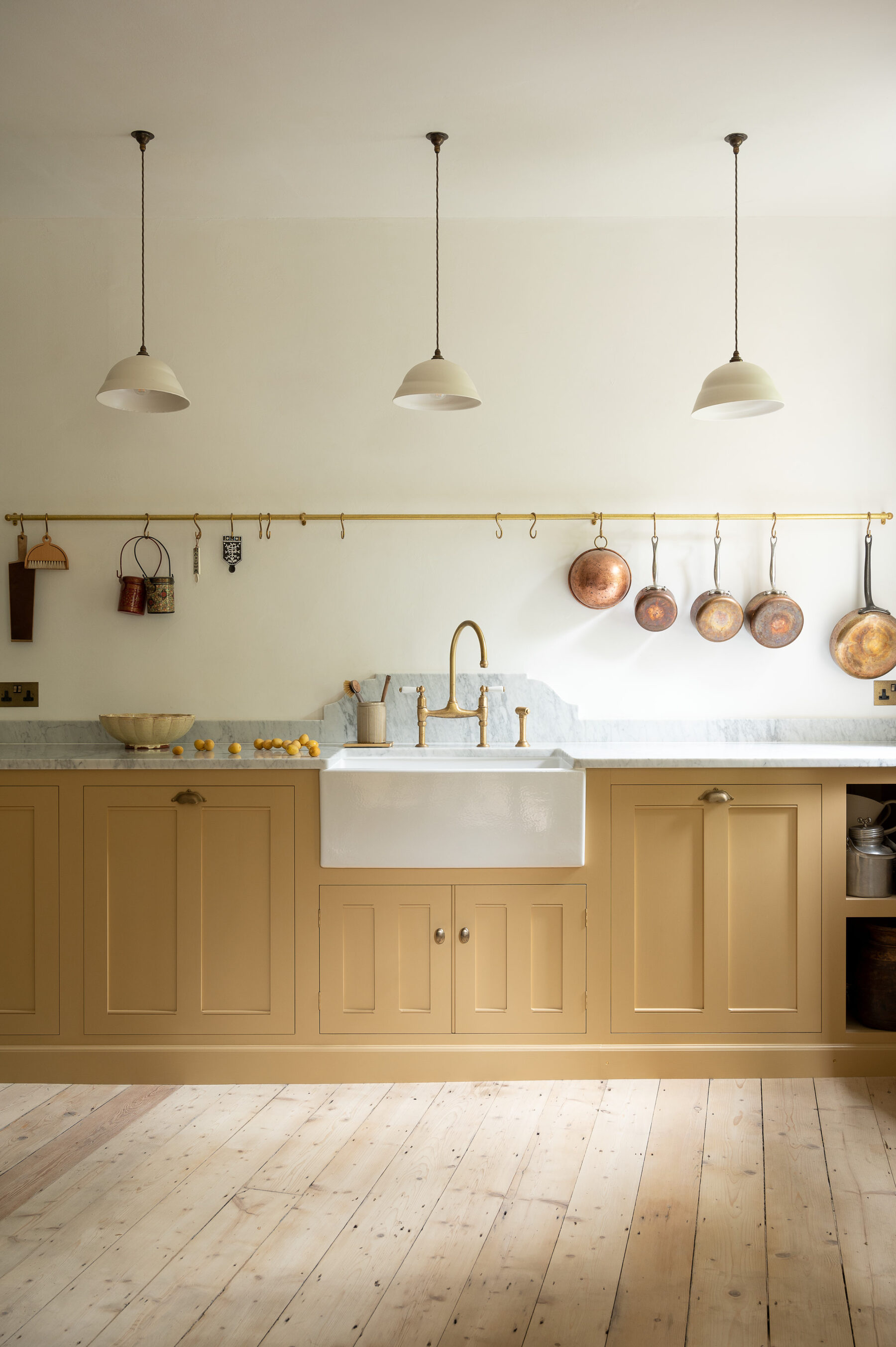
The room had great potential! It had tall ceilings and windows and lovely coving around the room. Having these existing period details always complements a deVOL kitchen beautifully, so we knew we had very good bones to work with. The overall layout came together quite quickly and it was mainly the smaller details that we took our time over, such as tap finishes, lighting options and worktop materials. We talked a lot about Carrara marble on the cooker and sink run, as well as the very pretty splashback design behind the sink which was inspired by an image found on Pinterest.
Were there any tough decisions that had to be made during the design phase?
We originally planned for a freestanding fridge freezer to sit next to the pantry but it was chunky and took up a lot of space. The owners were keen for the appliances to remain out of sight, so we decided to fit a small built-in fridge on the island and their carpenter cleverly stashed an integrated fridge freezer just on the other side of the glazed partition wall. This compromise worked really well and actually created more refrigeration capacity for them overall.
Another area we struggled with initially was how to install a ducting channel from the extractor to the outside. We knew that the chimney was functioning, however, it was extremely tall and stretched over eleven metres from the lower ground floor to the top of the house! The customers’ builder came up with the idea of making a hole in the left-hand side of the chimney and bringing the ducting channel over the left-hand side countertop cabinet and out to the external wall. We then made our cornice slightly taller than normal to hide it all away, I love that you wouldn’t know any compromise had been made from looking at the cupboard.
Although not immediately obvious from the photos, the sink run is on quite an angle – was this hard to work around?
We did debate whether to straighten the sink run out so that it was parallel to the cooker run but it almost felt stranger to try and correct it, so we opted to have the sink run on the angle. We did also discuss building the wall out to create a flat wall, however, the owners didn’t want to lose the window right in the corner which adds a good deal of extra light. I think they definitely made the right decision!
Did the customers have any deVOL ‘must haves’?
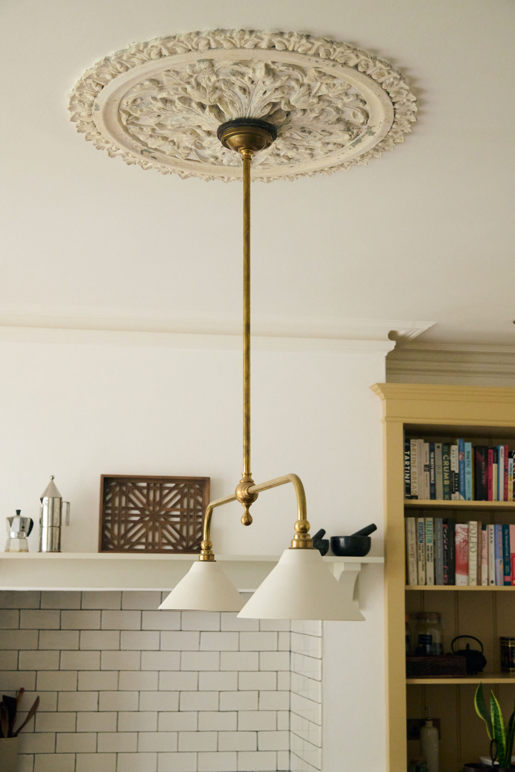
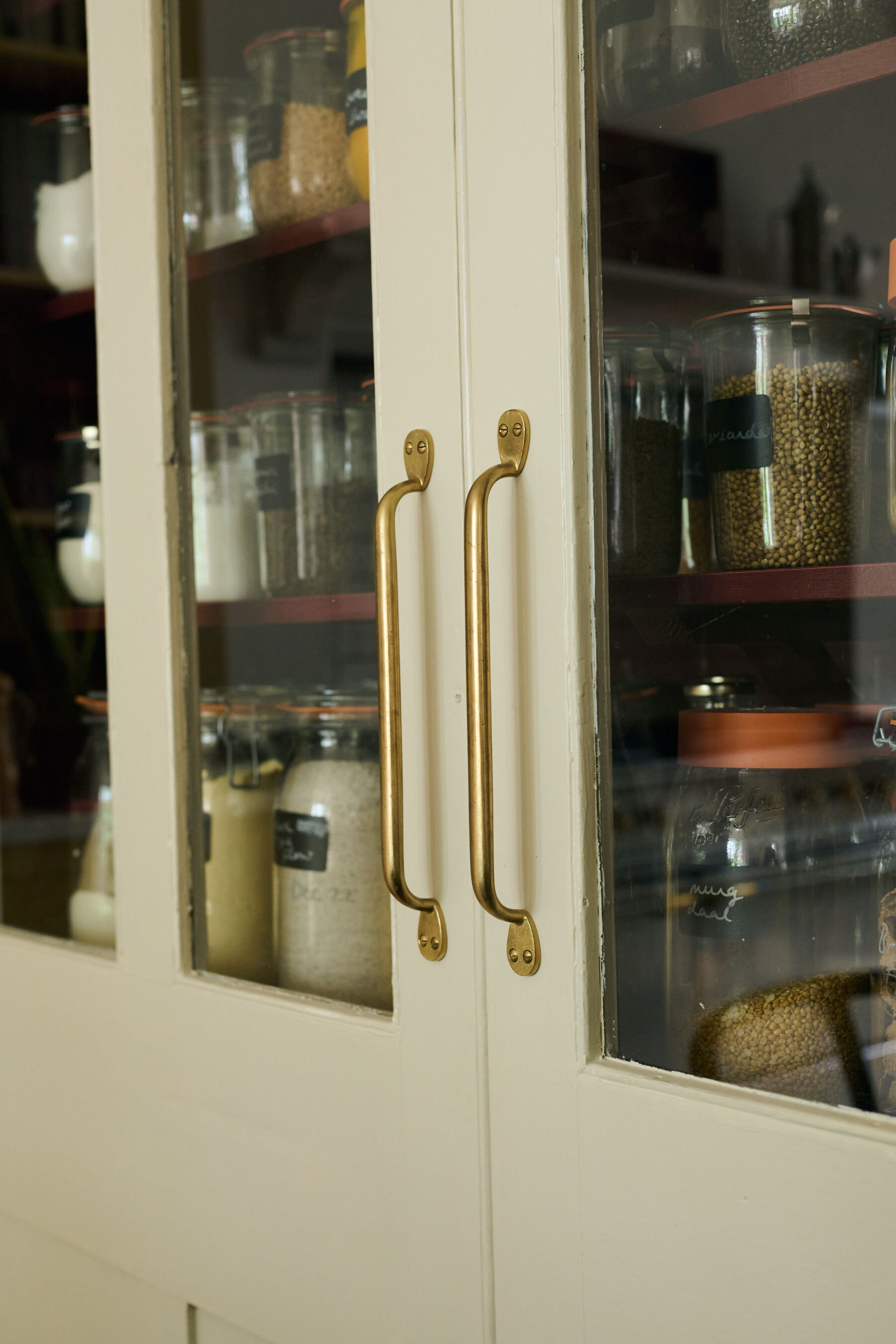
They really loved our handcrafted handles and Heirloom Gaselier Light and knew they would be part of the finished kitchen from a very early stage.
The kitchen was designed using a mix of our Classic English and Real Shaker cupboards, how did you decide this would be the best option for the space?
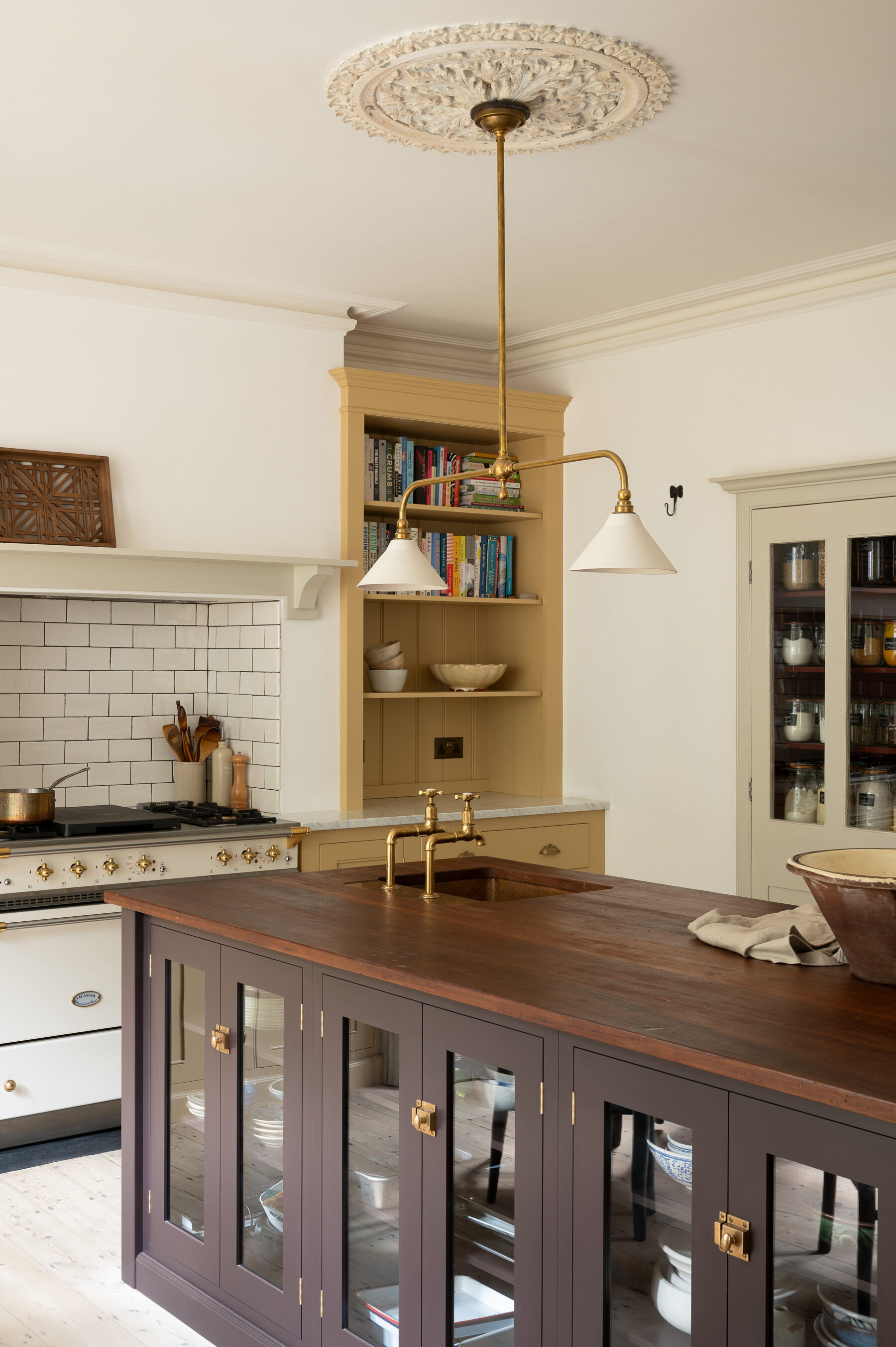
We chose to have Real Shaker furniture on the island because we were primarily using standard sizes for this piece. We then went for the Classic English fully bespoke furniture on the perimeters. On the cooker run, we wanted to optimise the height of the countertop cabinets and benefit from the extra details of the Georgian beading and overlapping doors.
The colours are incredible, did the customers have the shades set in their minds right from the start?
I agree, the colours are fantastic and all down to the customers! We discussed having a two-colour scheme right from the initial meeting but the choices changed throughout the process. They originally considered using hues from our Real Shaker collection, such as a mix of Bakehouse Green and Mushroom, or Clerkenwell Blue and Mushroom… oh and they always were tempted to throw a hint of Scullery Yellow in somewhere!
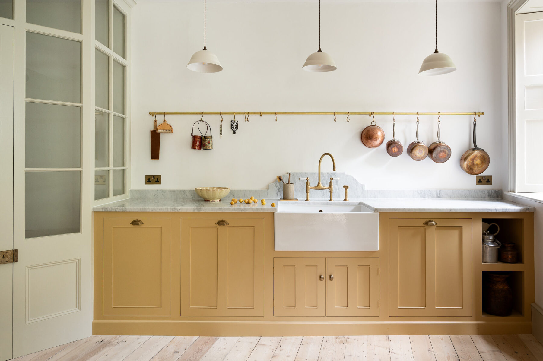
They ended up using bespoke colours that we mixed up in our workshop, a soft subdued yellow and a rich purpley brown. I think their final choices are so original, being brave really paid off.
The pantry was original to the home, so cool! How did you incorporate it into the design so it still felt in keeping with the new deVOL cupboards?
Yes, they were very lucky with the built-in pantry. We did discuss providing new matching doors but the existing ones were in good condition so I simply suggested updated handles to match the hardware in the rest of the kitchen. They painted the doors ‘Shaded White’ by Farrow & Ball – this is the shade for all the other woodwork in the room, such as the shutters and that beautiful screen, so it all felt quite cohesive.
I adore everything about this space but if I had to pick, I would say my favourite thing is the beautiful sink run with that perfect yellow, the ornate marble splashback, the brass hardware and that amazing internal glazed screen. What’s your favourite part?
I agree, I particularly like the internal glazed partition, I think it’s fantastic. I think the best thing is probably the colour choices, I think they are so creative and so individual.
Last but not least! What would you say your top three tips are for designing a beautiful and functional kitchen? I think everybody reading this will appreciate your knowledge!
This is a tricky question for sure – trying to condense it into three tips! I would say it’s important to design for the specific room you have, rather than trying to shoehorn in something that doesn’t fit. So if you have a lovely chimney, I would suggest opening this up and fitting a range cooker in. Whereas if you have a lot of windows and don’t have a place for a range cooker, you could look at having a venting hob on the island for instance.
The second thing would be making sure you have a home for everything, so tucking away some integrated bins and ensuring there’s a place for your day-to-day crockery. This helps with keeping the kitchen tidier and being able to find things when you need them.
My third tip would be to choose things you love, rather than being trend-led. Pieces you genuinely love will never go out of fashion and will always bring you joy.
– You can find this project on the Classic English page of our website.
– To get started on your very own deVOL kitchen project, please check out the Design Service tab of our website.
– You can keep up to date with all our latest projects and exciting news via our Instagram.

