Our Bond Street Showroom in NoHo, NYC – The Real Shaker Kitchen
3rd January 2020
You may have read my last blog, it was all about the lovely Classic English Kitchen in our showroom in New York. It’s the first display you see and experience as you enter the shop and one that really does make such a statement – bright colours and rich surfaces and beautiful bespoke craftsmanship. If you haven’t seen that blog yet, you can check it out here!
Next up is our Shaker kitchen, it follows on from our Classic display in the showroom and although similar in some ways, it’s also very different in others…
The Shaker range is our most popular, it’s modular in design which helps to keep costs down and its timeless style really does mean that it fits seamlessly into all homes and can be styled to all sorts of tastes too – you can’t go wrong with a deVOL Shaker Kitchen!!
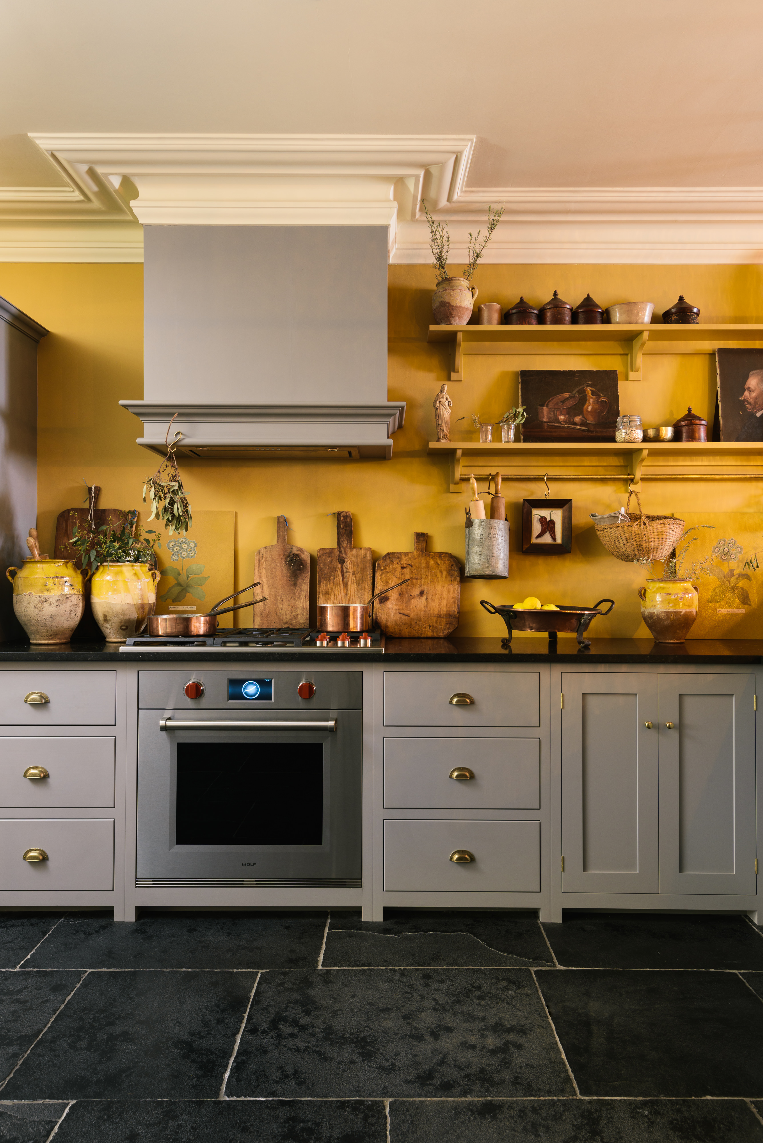
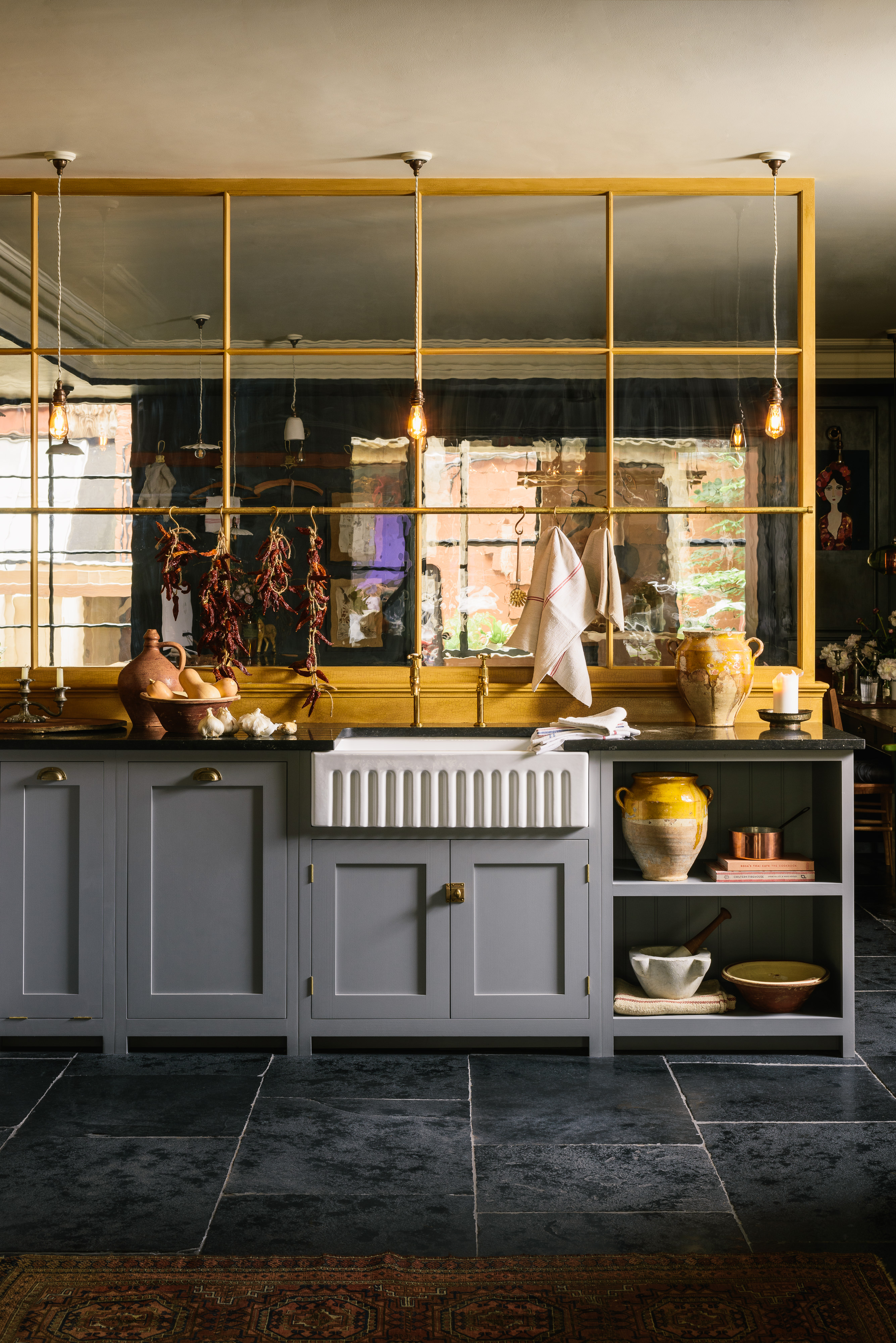
The Bond Street Shaker Kitchen is Mediterranean-inspired, moody greys and rich mustard yellows and little herbs and chillies drying on hanging rails and in big terracotta pots. You’ll find old confit preserving jars, bashed vintage copper pots and small, very beautiful, painted pieces of art. Our Creative Director, Helen, got it so spot on!!
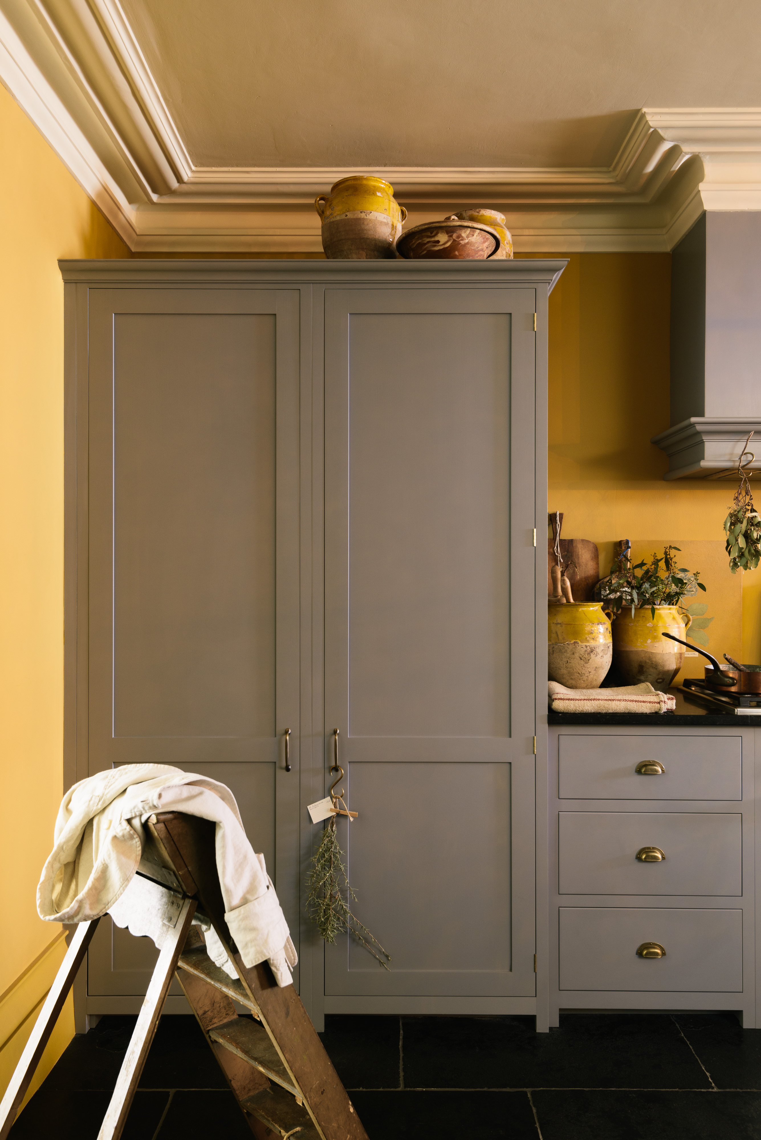
The L-shaped run in here is super simple, it’s made up of our standard sized pieces – larders and drawers and corner cupboards and open storage space, a real mix to show off the versatility of this furniture. It has been painted in Lead, a soft grey from our Shaker collection of colours, and finished with our handcrafted aged brass knobs and handles, which are all sand cast by our metal team in the studio at Cotes Mill. How perfect is this classic grey with the India Yellow walls and rich brass!? What a dreamy combination.
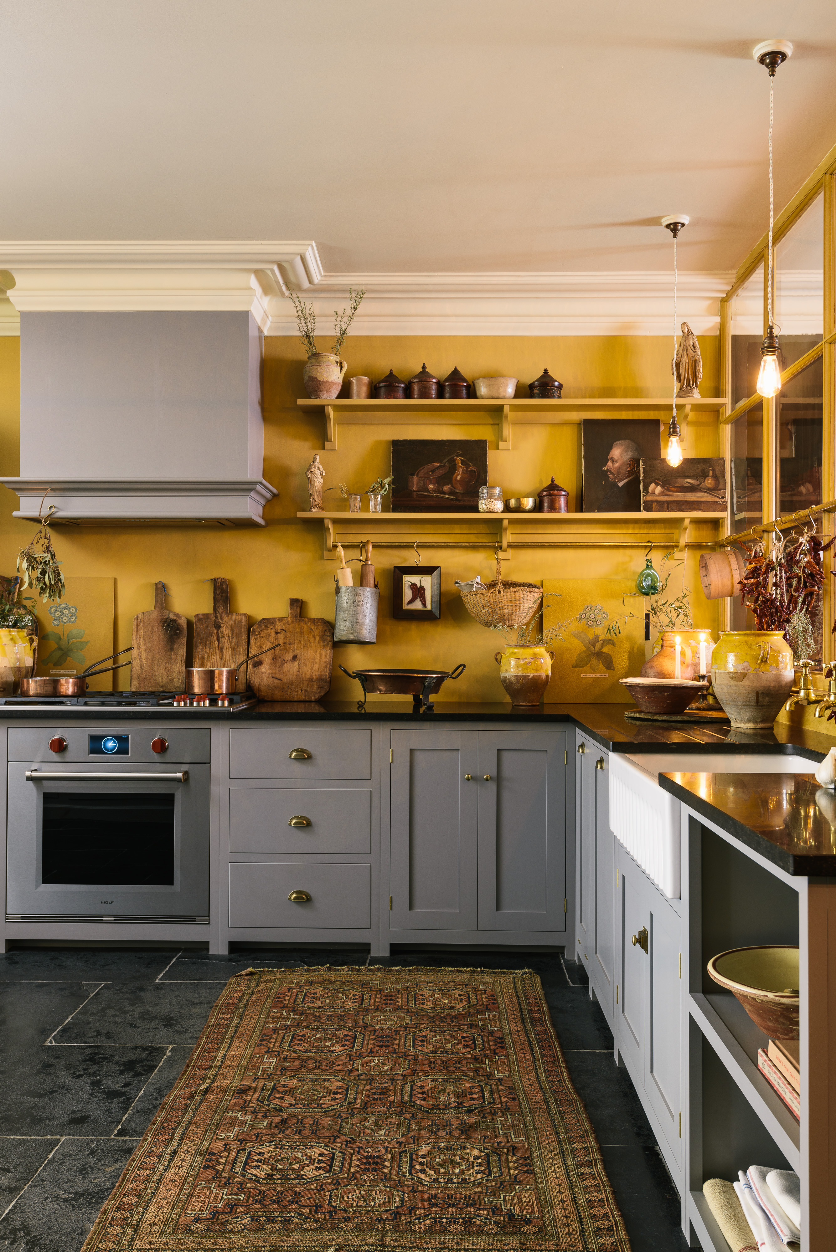
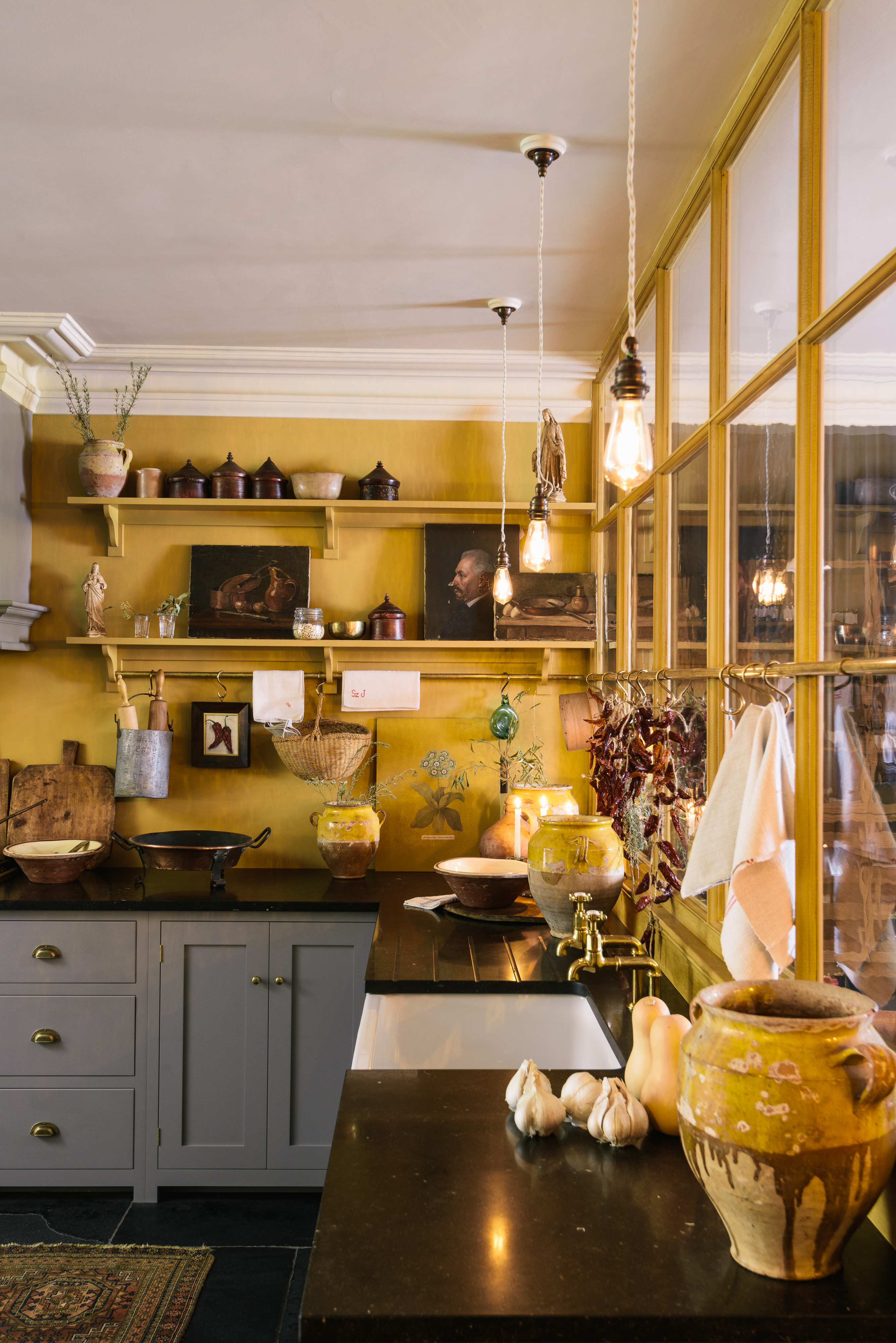
The worktop in this kitchen is Belgian Blue limestone, a really stunning natural stone formed in shallow seas… if you look really closely you can even make out tiny ancient fossils!! It has a matt finish and just feels really lovely and classic. Limestone is fairly soft so this worktop is sure to pick up a few scratches over the years, but if anything, that just adds to its charm – like a real, well-used and very loved kitchen in the Mediterranean.
Helen went for a Fluted Single Sink in here, a traditional ceramic glazed sink but with beautiful added flutes on the front. We make this sink in collaboration with Shaws of Darwen, I love that it’s a little different but ultimately still a timeless and classic choice – and it looks especially good with a pair of our aged brass Mayan taps.
Just above the sink run, you’ll notice the fabulous Crittall-inspired partition wall. We needed to design something to act as a separation between displays but a standard wall was never going to do the job, it would close off different areas too much and not allow the light to shine right through the showroom… so we came up with this!
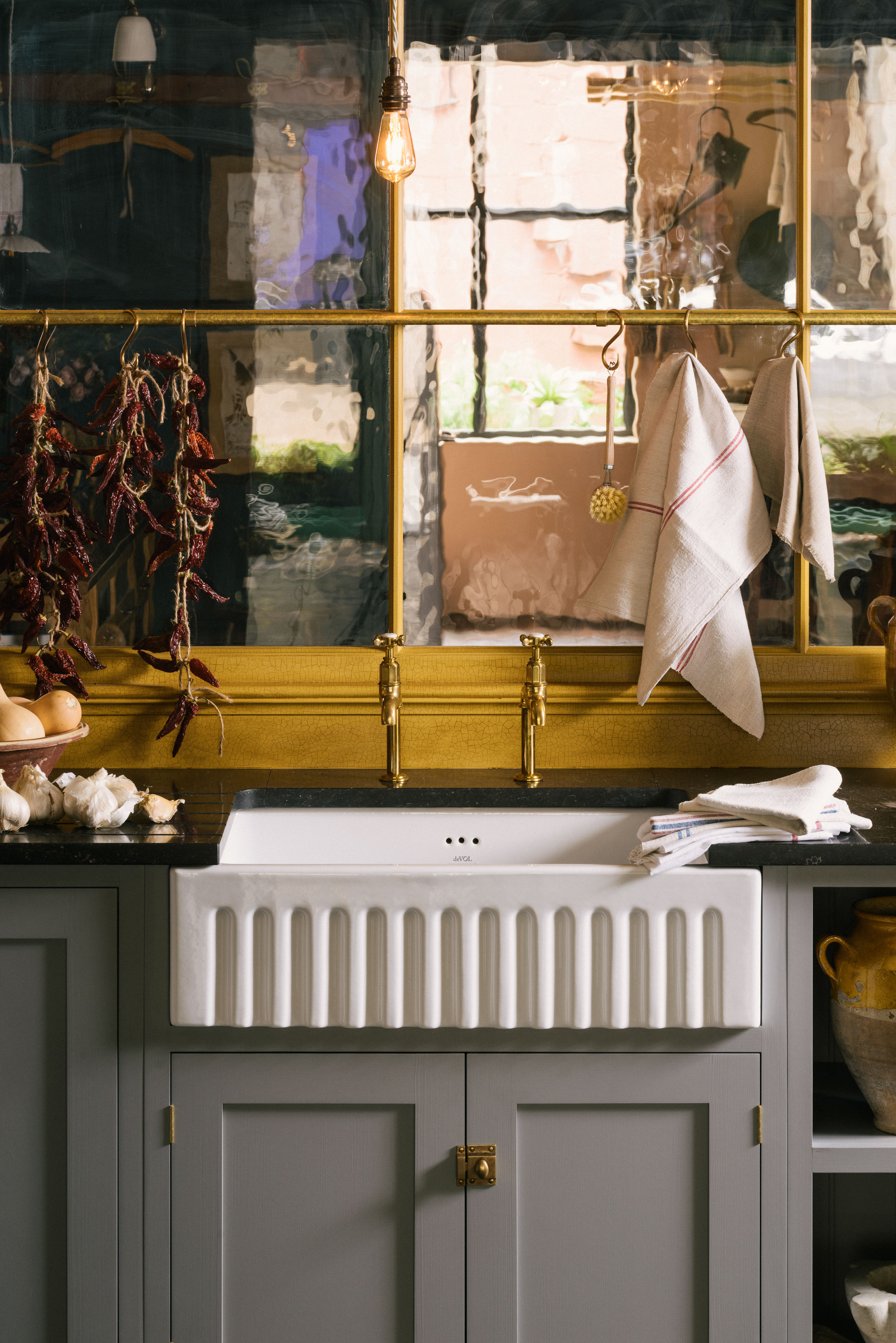
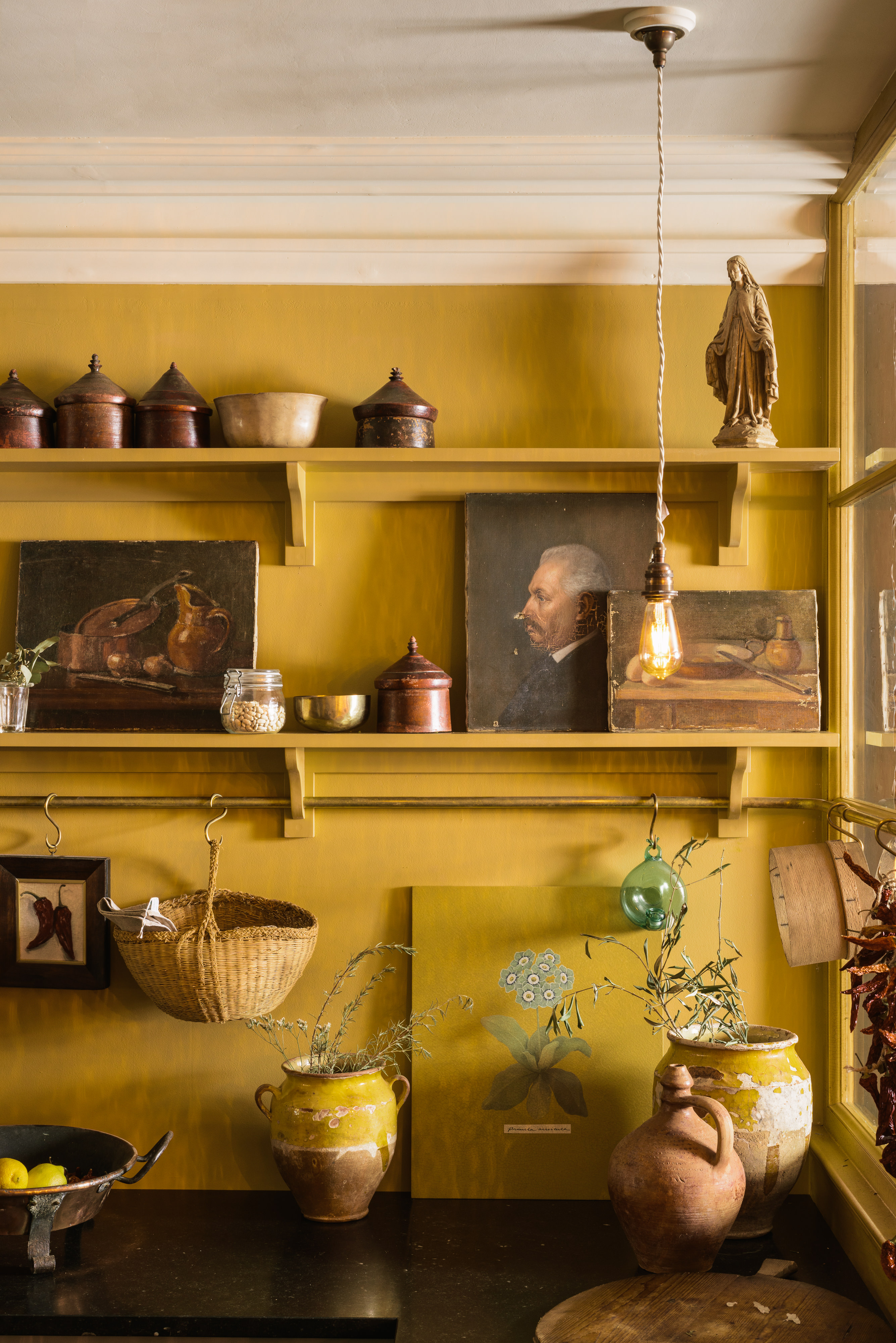
The lower half of the partition is panelled and this upper section is glazed. It was designed using wavy, crinkly heritage glass and wooden frames, painted in the same fabulous deep yellow and finished with a crackle glaze to take away the newness and add that sense of age and authenticity we really wanted to create in the showroom. A long brass rail spans the entire glazed wall, it curves at the corner and continues to the other wall where it has been fitted beneath one of our simple Shaker shelves. Our hanging rails are turning into one of our most popular kitchen accessories, what a functional little thing for just about anywhere in the kitchen – above the sink for brushes, above the cooker for copper pans, beneath a shelf for mugs and tea towels.
The shelves have been filled with lovely bits and pieces that really do transform this kitchen from a showroom to a space that feels real, with style and personality. Paintings and pots and jars, things with soul and charm that anybody would love to display in their kitchen.
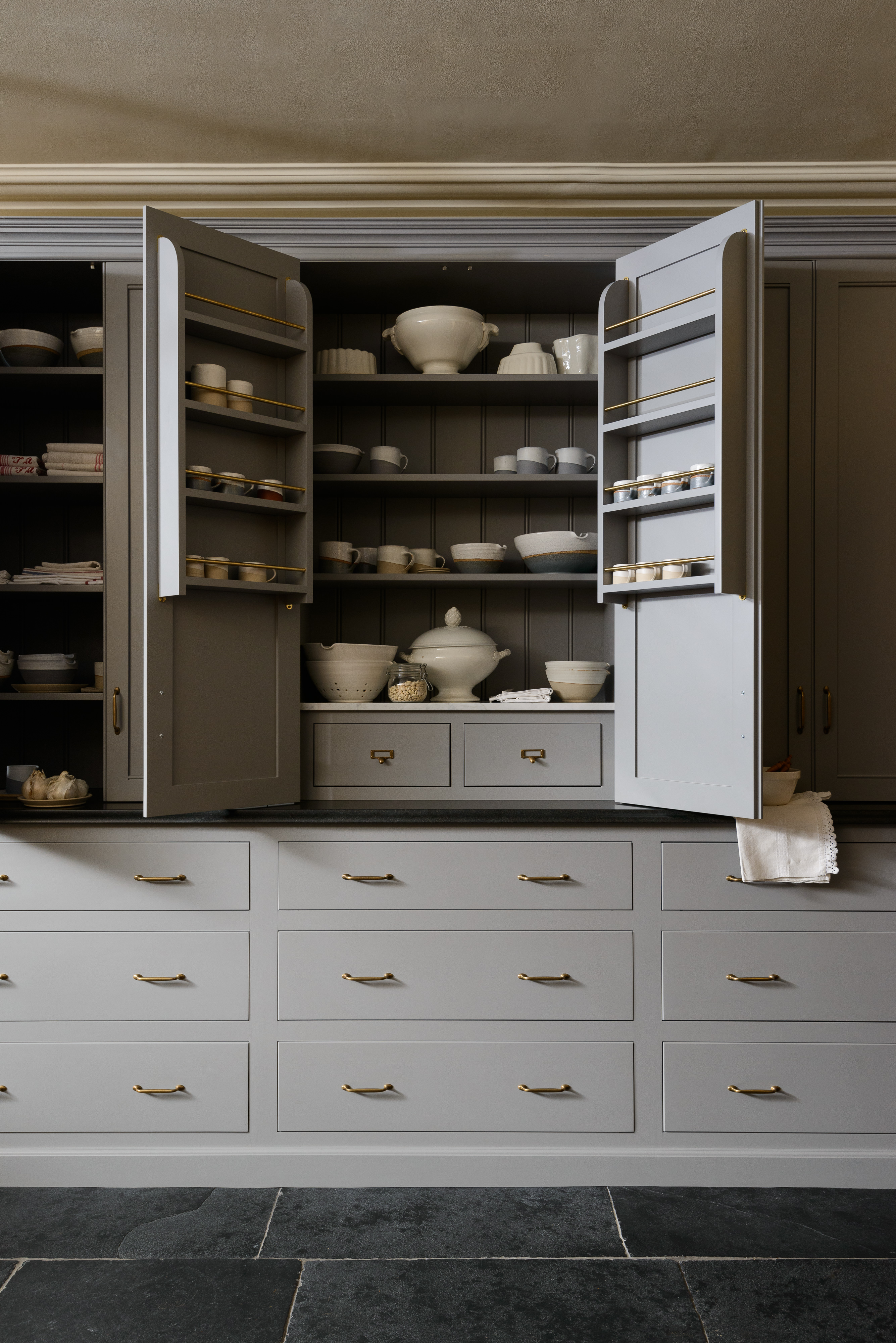
Opposite this beautifully simple run of Shaker furniture, you’ll find a Classic English dresser. Measuring approximately three metres wide and two and a half metres tall, this piece is strong and sturdy and so elegant – and shows just how happily these two ranges can sit side by side. Each countertop cupboard in this piece has a customised internal, from fixed shelves, drawers topped with Carrara marble and solid oak plate racks… and below is all personalised too! In the drawers you will find oak cutlery inserts, they are double layered and slide to each side so you can really make the most of all the space.
All in all, this is one very lovely kitchen. A little moodier than the Classic display, and a little more understated too, it’s the kind of kitchen that everybody would want to turn up to on a cold, windy, rainy night and settle down with a good bottle of red and lots of friends. It’s happy and cosy and inviting, I really do love it.
My next kitchen blog will be on our Bond Street Haberdashery, it’s a beauty!!
– Take a look at the Shaker page of our website to see our favourite projects and learn more about this lovely range.
– You can find our NYC showroom at 28 Bond Street, NoHo – more information on our contact page here.
– Email usa.enquiries@devolkitchens.com to get in touch with our team in New York, we’d love to hear from you.
– Check out our Instagram here, it is always filled with our latest adventures and most fabulous projects!

